© 2026 — Craxinno Technologies



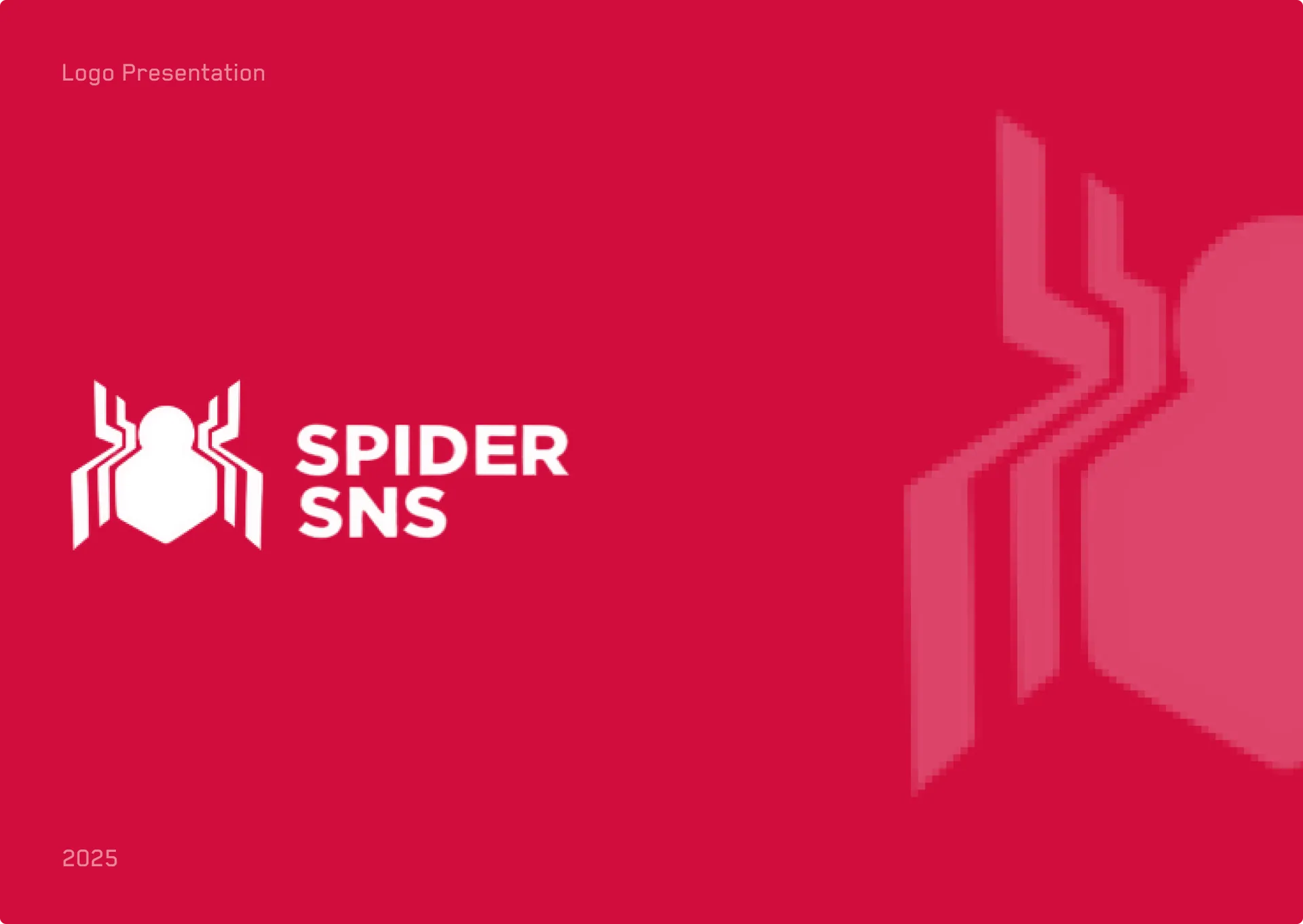
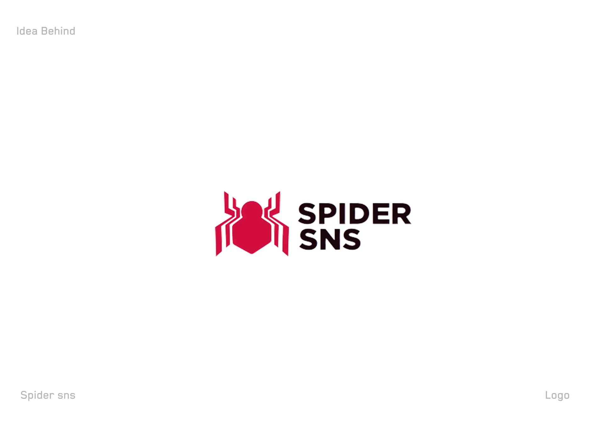
The Spider SNS logo design gives a social-network brand a bold, iconic spider emblem built for instant recognition. Spider SNS needed a mark with attitude that reads clearly at any size, so we shaped an angular spider symbol paired with a heavy, condensed wordmark. A striking crimson red drives energy and boldness; black and white keep the system flexible across surfaces. The result is a confident, high-contrast identity that works as a stacked lockup or a standalone icon. See more of our web design work for related brand systems.
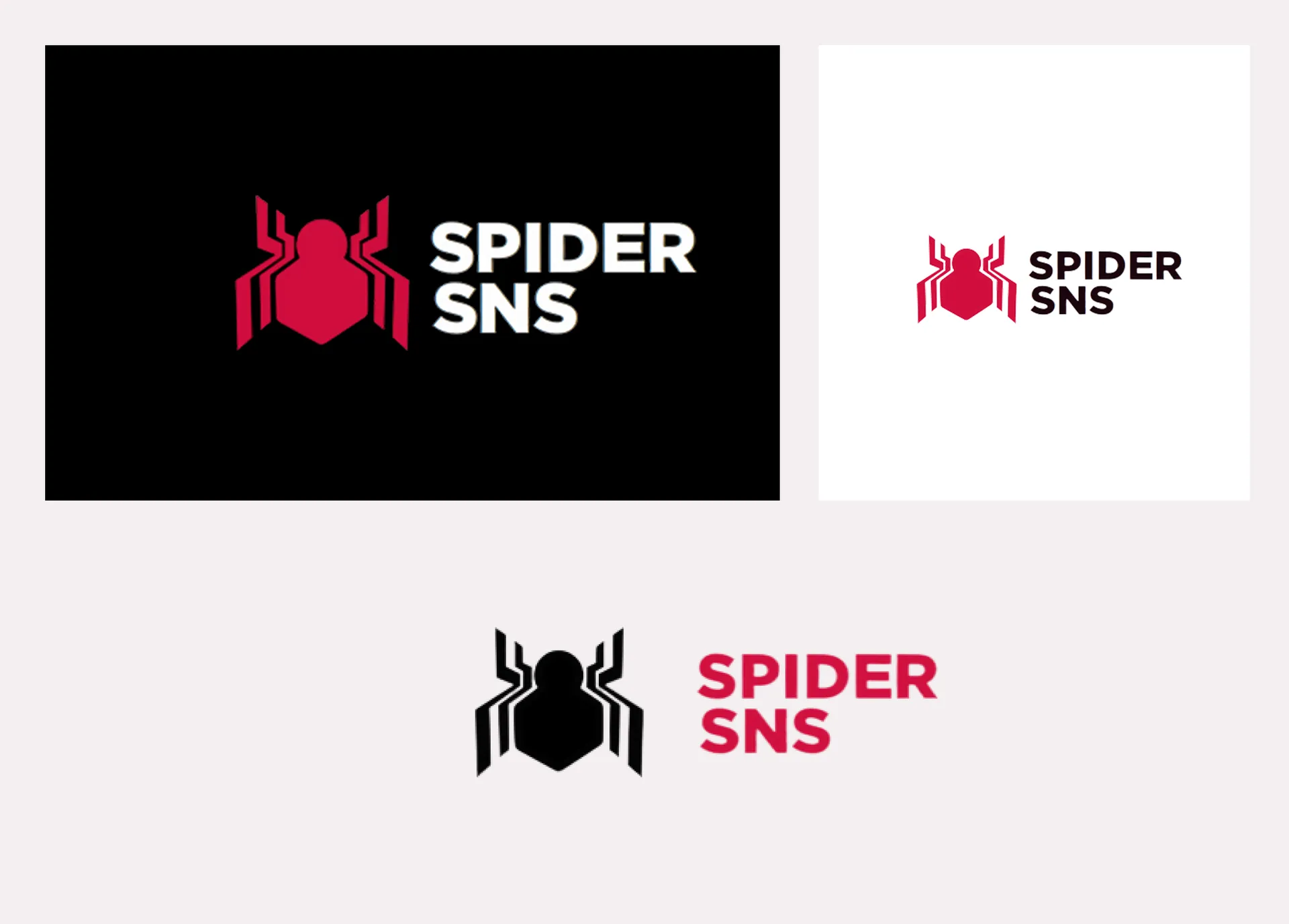
We led with impact. The Spider SNS logo design centres a sharp, symmetrical spider mark whose angular legs give it a modern, tech-forward edge. We paired it with a bold condensed sans wordmark so the name feels strong and stacks neatly beside the symbol. A vivid crimson anchors the brand with energy and confidence, backed by pure black and white for maximum versatility. We delivered the identity across dark, light, and colour treatments so it holds on any background.
A complete primary identity. The build includes the spider symbol, a stacked "Spider SNS" wordmark lockup, dark-background, light-background, and colour treatments, plus a standalone icon. Each variant preserves the same spider proportion, condensed wordmark, and crimson-and-black logic across print and screen.
The design reads instantly: a bold spider symbol gives the brand a memorable, ownable icon that works down to a favicon or app tile. The condensed wordmark adds strength and pairs cleanly with the mark. The crimson-and-black palette delivers high contrast and energy, standing out on light or dark. Multiple treatments keep the identity consistent from a dark app screen to printed collateral.
For a social brand, success is recognition — users spotting the mark instantly across feeds and app stores. A bold symbol, a strong wordmark, and a flexible high-contrast system give Spider SNS a face that scales across web, app, and print. Explore our full design services to scope a custom brand identity for your platform.