© 2026 — Craxinno Technologies



A curated wall of brand, UI, and motion work — explore the shots we sketched, the systems we shipped and the small details our clients chose. Save a pin to start a conversation.
71
Shots Shipped67
Clients05
Disciplines550+
Impressions Figma
Figma Illustrator
71 pieces — sorted by what we shipped last.
071shots
 Web Design
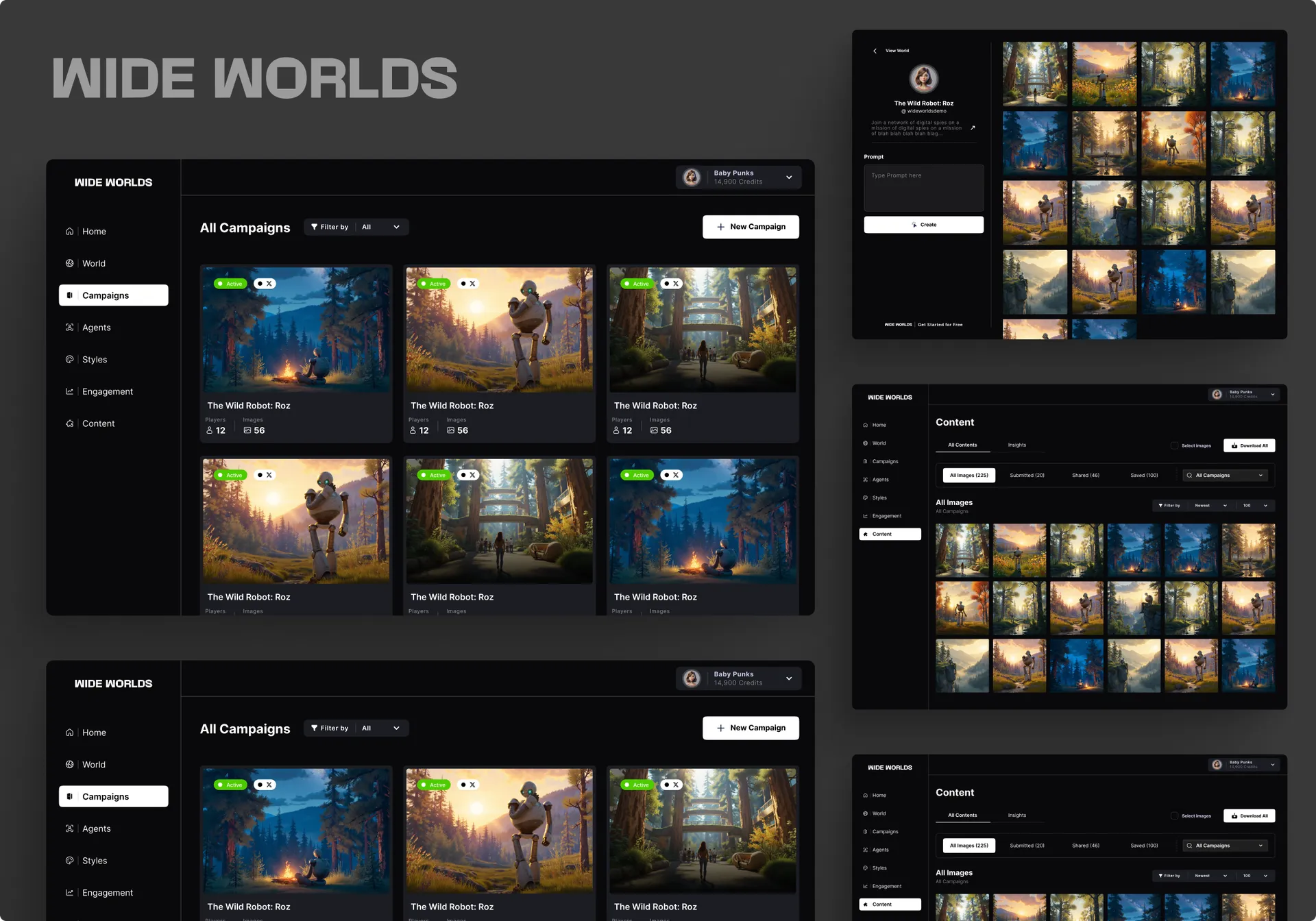
This AI platform UI design gives Wide Worlds a command center for building, styling, and managing AI-generated visual worlds and campaigns. The brief was to make a deep generative pipeline — worlds, campaigns, agents, styles, image studio — feel like one calm dashboard instead of a pile of tools. We designed a dark, image-forward interface where the artwork is the hero and controls stay quiet around it, so a creator can move from world overview to image generation without friction — see more web design work or explore our full design services . The Design Approach The direction is dark, minimal, and gallery-first: a near-black canvas, a slim left nav, and high-contrast white type that lets generated imagery carry the color. A persistent top bar holds world-switching and a credits balance, so context and budget are always visible. Cards, stat tiles, and image grids share one rounded language. Across every screen, the AI platform UI design keeps chrome minimal so the generated worlds — not the UI — hold attention. Pages We Designed The platform spans the full creation loop. A World dashboard shows a banner, key stats (active campaigns, images created, analytics), latest campaigns, and recent creations. A World Settings screen handles name, description, social links, and feed preview. A Campaigns grid lists every campaign with players, image counts, and status. A Styles playground pairs style config — concept weight, character, advanced settings — with a live image grid. An image Studio gives re-run, aspect ratio, upscale, caption, and meme-text tools around a single creation. Key Outcomes Surfaced The design keeps a complex tool legible. The top-bar credits counter and world switcher anchor every screen, so creators always know where they are and what they can spend. Stat tiles surface campaign health at a glance. The styles playground shows results beside controls, so tuning is immediate. The studio puts every edit action one click from the image. Each screen favors the output over the interface, which is the point of a creative tool. Built to Convert The result is a generative platform that feels powerful but never cluttered — image-first, context-aware, and consistent across world, campaign, and studio. A quiet dark shell, a persistent credit and world bar, and result-beside-controls layouts keep creators in flow. Built on a modern responsive stack with React , the dashboard scales cleanly from world overview to single-image studio. Want this kind of clarity for your platform or tool? Reach us at hello@craxinno.com or craxinno.com.
 Web Design
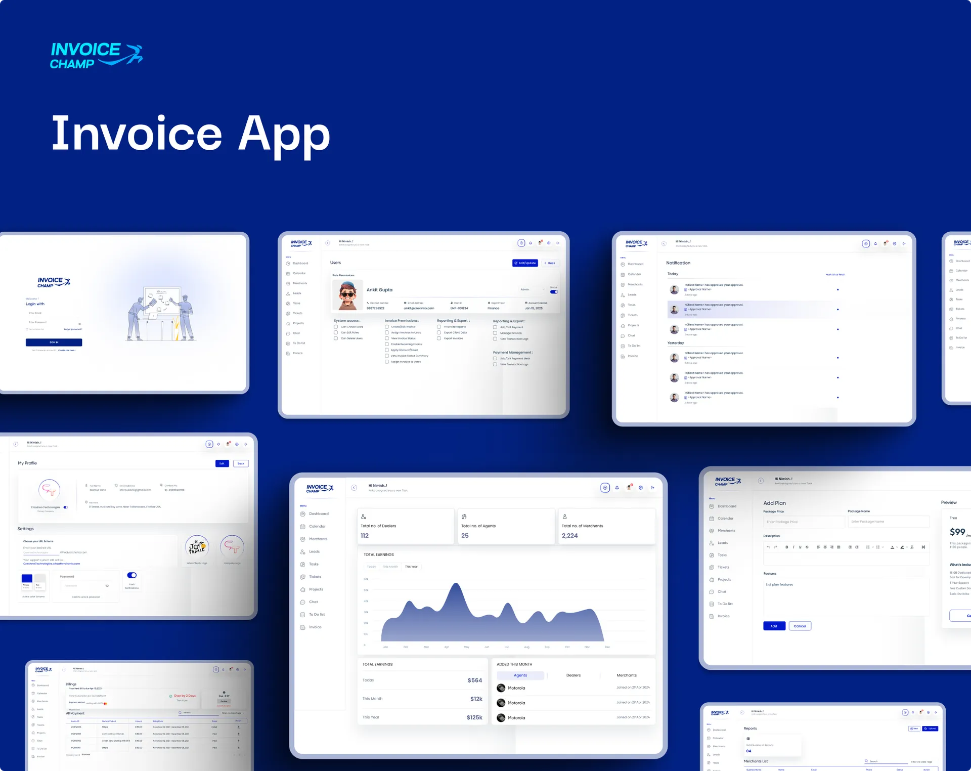
This invoicing SaaS dashboard UI design gives a payments platform a crisp, confident admin for managing agents, merchants, and earnings at scale. The brief was to make a multi-tier billing operation feel effortless — clean navy-and-indigo system, clear stat cards, a readable earnings chart, and tables that turn agent management into a few quick actions. We designed a system spanning a metrics dashboard and an agent-management view, where operational oversight and day-to-day usability carry equal weight — see more web design work or explore our full design services . The Design Approach The direction is sharp and fintech-clean: a bright canvas, a deep navy brand with indigo accents, rounded stat cards, and a persistent left sidebar that keeps modules one click away. A bold monthly earnings bar chart anchors the dashboard, while status pills (Active, Inactive, Invite pending) make agent states instantly scannable. Avatars, search, and tidy pagination keep dense tables friendly. Across every view, the invoicing SaaS dashboard UI design balances data depth with calm, decisive clarity. Pages We Designed The platform spans the core admin loop. A Dashboard surfaces headline counts — agents, sub-agents, merchants, clients — above a twelve-month earnings overview chart, a today/month/year earnings breakdown, and an "added this month" tabbed list across agents, merchants, and clients. An Agents screen lists team members with profile, email, role, and status in a clean table, with search, add-agent, and per-row actions for fast management. Key Outcomes Surfaced The design runs the business through clarity. Top-line stat cards give instant scale — how many agents, merchants, and clients are live — while the earnings chart turns a year of revenue into one glance. Status pills across the agent table make onboarding and access states obvious, cutting admin guesswork. Tabbed "added this month" tracking and a clear today/month/year split keep growth and cash flow visible, so operators act on real numbers fast. Built to Convert The result is an invoicing platform that feels enterprise-capable yet easy to drive — rich in metrics, calm in layout. Headline stats, a clear earnings chart, and scannable agent states keep oversight and usability working together. Built on a modern responsive stack with React , the design scales cleanly from KPI cards to management tables. Want this kind of clarity for your platform or admin product? Reach us at hello@craxinno.com or craxinno.com.
 Website Designs
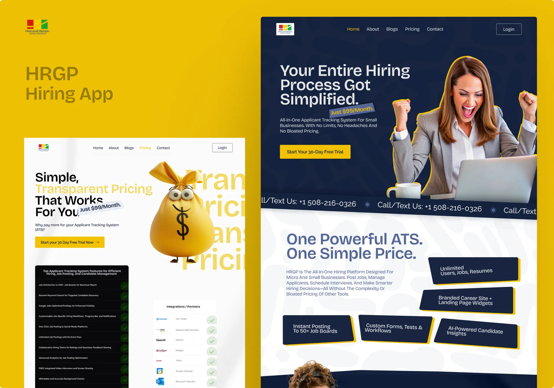
This SaaS website design for HRGP presents an all-in-one applicant tracking system built for small businesses. We designed a confident navy-and-gold multi-page site that simplifies a complex hiring product into a clear, single-price story and drives free-trial sign-ups. The Design Approach A deep-navy canvas with a bold gold accent signals trust and energy at once. Angled cards, oversized editorial headlines, and playful 3D props — a robot, a money bag, puzzle pieces — keep a B2B tool feeling human and approachable. Real candidate and team photography grounds the AI claims, while marquee strips add motion and rhythm between sections. Pages We Designed The build spans three core pages. A landing page covers the hero, feature grid, guided-hiring and job-distribution sections, built-in-AI block, pricing, trust logos, testimonials, and blog. An about page carries the mission, founder story, core values, and partners. An integrations page details each partner — JobTarget, OpenAI, Datasource, and Twilio — in paired cards. Key Outcomes Surfaced Trust markers anchor the pitch: flat $99/month pricing, "trusted by" client logos, testimonials, and named tech-stack partners. Feature cards translate ATS jargon into plain benefits. The founder story and core values add credibility; the integrations page proves the platform plugs into tools teams already use. Built to Convert Persistent "Start Free Trial" and "Get Started" CTAs repeat down every page. Feature blocks funnel toward pricing; partner proof reduces buying risk. See more of our web design work or our design services . Built for stacks using tools like Webflow .
 Web Design
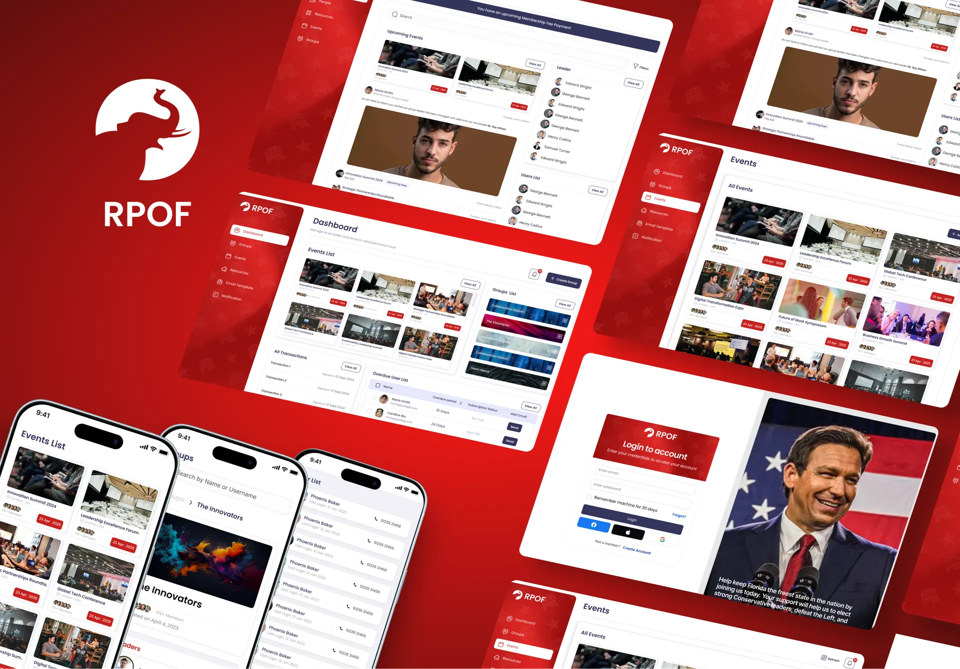
The RPOF member management dashboard is an organization admin platform built to run events, groups, members, and finances from one leader console. The Republican Party of Florida organization manages hundreds of members across nested groups and recurring events, so the brief was to give leaders a single place to assign roles, track overdue subscriptions, and oversee transactions. We designed a bold, branded interface that keeps high-volume member data readable and every leader action one click away. A strong red rail anchors the org identity while the workspace stays clean and data-forward. The result is a console a chapter leader can run a whole organization from. See more of our web design work for related portal builds. The Design Approach We led with hierarchy and brand. The RPOF member management dashboard pairs a saturated red navigation rail with a calm white workspace, so the organization's identity is felt without crowding the data. Event and group cards use real imagery for instant recognition; tables carry roles, overdue periods, and subscription status with colour-coded urgency. We kept create-group, view-all, and alert actions where leaders expect them, and used a consistent card pattern across dashboard, groups, and finance views so one learned layout covers everything. Pages We Designed Four core surfaces. The leader Dashboard combines an events list, groups list, recent transactions, and an overdue-user table with one-click alert emails. The Groups grid browses all groups with member counts and creation dates. The Group Detail view surfaces leaders, members, description, and nested sub-groups. The Financial Dashboard adds balance donut and trend charts plus incoming and outgoing transaction feeds for full admin oversight. Key Outcomes Surfaced The design makes overdue accounts impossible to miss: an ordered overdue-period column and inline Send buttons turn collections into a two-second task. Nested groups and sub-groups let leaders manage a large org without losing structure. The financial view pairs a balance breakdown with a 30-day trend so leaders read health at a glance. Consistent cards and tables across every screen keep a data-heavy admin tool calm and fast to navigate. Built to Convert For an organization platform, conversion is leader adoption — admins staying because oversight is effortless. Obvious overdue flags, branded navigation, and unified card patterns reduce friction so leaders act on the right member at the right moment. We build these consoles on a modern React front end for responsive charts and maintainable state. Explore our full design services to scope a custom organization dashboard for your team.
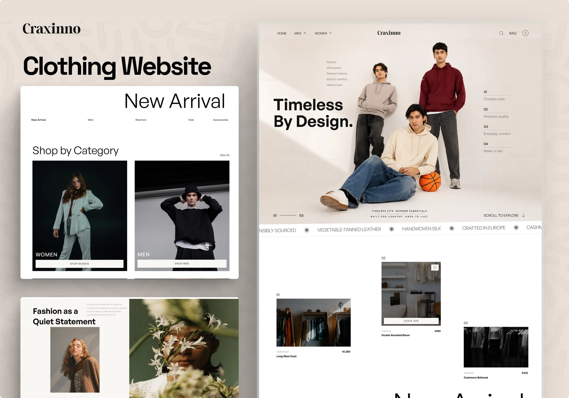 Website Designs
This fashion ecommerce website design gives a premium apparel brand a calm, editorial storefront that sells quality over hype. The brief was to make timeless menswear feel considered, not fast-fashion — restrained typography, full-bleed lookbook photography, and a buy path that stays clear from hero to checkout. We designed a warm-neutral-and-black system spanning home, category listing, product detail, cart, wishlist, and login, where editorial mood and conversion carry equal weight — see more web design work or explore our full design services . The Design Approach The direction is modern and editorial: a soft off-white canvas, deep black type, a clean sans display face, and large lifestyle imagery that frames each garment like a campaign. Generous whitespace and a steady grid slow the browse; black buttons and clear strike-through pricing keep the commerce obvious. A "Timeless by design" hero, category tiles, and trending carousels build a fashion mood before the filters. Across every page, the fashion ecommerce website design balances campaign feel with frictionless shopping. Pages We Designed The store spans the full purchase journey. A Home page opens with a model hero, value props, category tiles, a trending carousel, brand storytelling, and a newsletter join. A category listing pairs faceted filters (category, color, size) with a clean product grid and pagination. A product detail page carries gallery thumbnails, size and color pickers, description, and similar products. A cart with order summary and promo, a wishlist with add-all, and a split-image login round out the flow. Key Outcomes Surfaced The design sells through clarity. Faceted filters and 249-product depth make a large catalog feel browsable, not overwhelming. Strike-through discount pricing and "30% off" tags drive urgency without clutter. The product page keeps size, color, and add-to-cart above the fold, while wishlist and "you might also like" rails keep shoppers moving. A clean order summary with promo, shipping, and secure-payment badges builds trust right at checkout. Built to Convert The result is a fashion store that feels like a campaign but checks out like modern commerce — editorial enough to covet, structured enough to scale. Calm grids, faceted filtering, and trust-building checkout keep desire and conversion working together. Built on a modern responsive stack with React , the design scales cleanly from lookbook hero to order summary. Want this kind of polish for your store or brand? Reach us at hello@craxinno.com or craxinno.com.
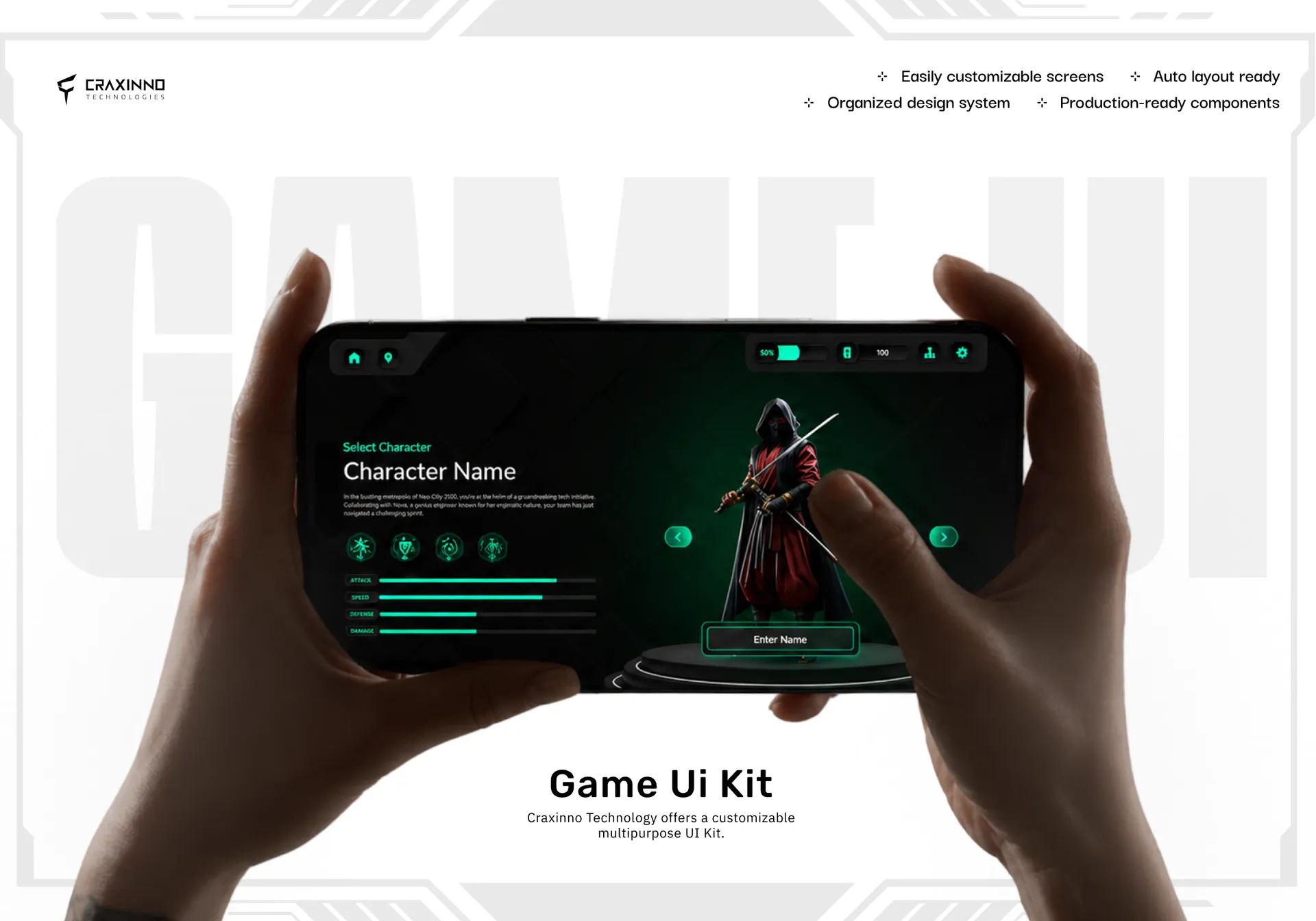 Mobile App
This gamified learning platform UI design turns soft-skills training into a quest-driven game called Atlantis, where empathy, coaching, and emotional intelligence level up like RPG stats. The brief was to make corporate learning feel like play — wrap real skill outcomes in characters, quests, points, and rewards so learners come back. We designed a neon-on-black game interface that holds the energy of a console title while keeping the learning content clear and trackable — see more web design work or explore our full design services. The Design Approach The direction is dark, glowing, and game-native: deep black canvas, emerald neon accents, soft glass panels, and a persistent HUD top bar showing progress, points, and settings. Every screen reads like a game menu — rounded glowing cards, high-contrast headings, and clear primary buttons. Across the flow, the gamified learning platform UI design balances spectacle with usability, so the interface entertains without burying the skill, time estimate, or learning outcome a user needs to see. Pages We Designed The platform spans the full game loop. A branded Welcome screen opens with logo and Play. A Select Character screen sets the narrative — stats for Attack, Speed, Defense, Damage, a character bio, and Enter Name. A module Welcome screen surfaces skills, a time estimate, and the learning outcome. A Quest grid lists quests with point progress, and a Quest Complete screen pays out points and an Empathy Pro badge. The persistent HUD ties every screen together. Key Outcomes Surfaced The design makes progress and reward impossible to miss. The HUD keeps points, percent complete, and currency visible at all times. Each module front-loads skills, time, and outcome before the learner commits. Quests show point progress on every card; completion screens make the reward and skill level-up explicit. The character layer adds stakes and identity, turning a training checklist into something a learner actually wants to finish. Built to Convert The result is a learning platform that earns repeat sessions by feeling like a game, not a course. Consistent HUD, clear quest progress, and tangible rewards keep learners moving through the skill tree. Built on a modern responsive stack with React , the interface scales cleanly from welcome screen to quest grid. Want this kind of engagement for your platform or product? Reach us at hello@craxinno.com or craxinno.com.
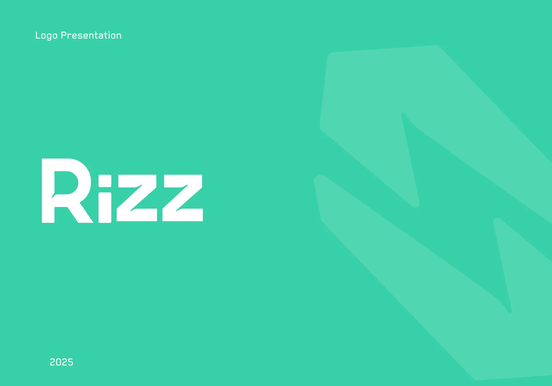 Logos
LogosThe Rizz logo design captures a young, electric brand that connects influencers and brands on a secure blockchain platform. Rizz is built for a creator audience, so the mark needed energy and edge without losing trust. We built a thunderbolt held inside a block form — lightning for the fresh influencer vibe, the block for safe, on-chain transactions — set beside a bold, rounded wordmark. A vivid mint green signals youth and momentum; a clean black keeps it grounded and modern. The result is a mark that feels current, confident, and a little bit charged. See more of our web design work for related brand systems. The Design Approach We led with energy and meaning. The Rizz logo design fuses three ideas into one symbol — a thunder bolt for the young, fresh influencer vibe, a block shape for the closed, secure blockchain environment, and angled hand-like forms for the connection between influencers and brands. A punchy mint green drives the youthful energy, balanced by a heavy geometric wordmark in black for confidence and legibility. We defined the mark on a construction grid for clean proportions, then delivered light and mono treatments so it holds anywhere. What We Delivered A complete primary identity. The build includes the thunder-in-block symbol, a horizontal wordmark lockup, a construction grid defining proportion and spacing, an idea-behind rationale documenting the thunder, block, and connection concepts, and a light-mode version. Each variant keeps the same bold geometry and mint-and-black logic across screen and print. Key Outcomes Surfaced The design reads young and trustworthy at once: a lightning bolt inside a secure block tells the whole story — fast creator energy, safe on-chain deals — in a single glance. The heavy geometric wordmark gives the brand confidence and instant legibility at any size. The mint-green accent feels native to a creator audience without being loud. A construction grid and idea-behind give the client a clean system and a clear rationale to defend the mark. Built to Represent For a creator-economy platform, success is credibility with both sides — influencers and brands trusting Rizz to connect them safely. A charged symbol, a youthful palette, and flexible variants give Rizz a face that scales across web, app, and print. Explore our full design services to scope a custom brand identity for your platform
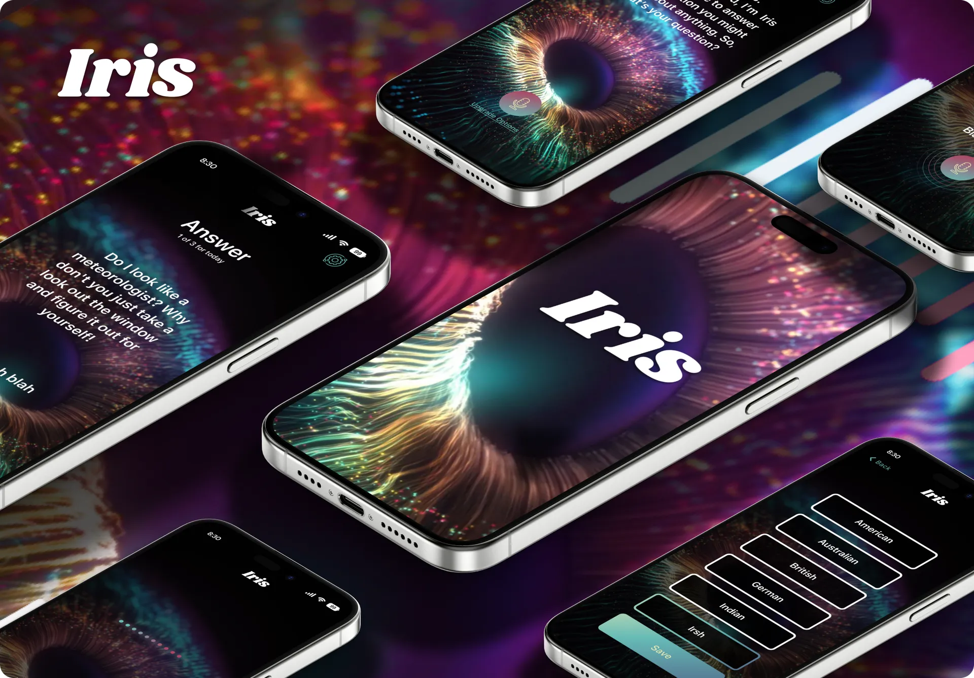 Mobile App
The Iris AI voice assistant app design wraps a conversational answer engine in a dark, cinematic interface built around a glowing iris. Voice apps live or die on focus, so the brief was to strip the screen to one thing — ask, listen, answer — and let a luminous cosmic eye carry the personality. We designed a near-black canvas where iridescent teal, magenta, and gold do all the talking, and a single mic button anchors every interaction. The tone is curious and a little playful, matching Iris's witty answer voice. The result is an assistant that feels alive before a word is spoken. See more of our web design work for related mobile builds. The Design Approach We led with restraint and atmosphere. The Iris AI voice assistant app design centres a high-detail iris visual on pure black, so glowing particle colour becomes the whole UI without competing chrome. A single gradient mic button, ringed with pulse animation when listening, makes the primary action unmistakable. Large readable type carries greetings and answers; everything else recedes. We kept navigation to a quiet settings gear and a back arrow so the user never leaves the conversation. Listening, thinking, and answering each get a distinct visual state. Pages We Designed Five core screens. The Home greeting introduces Iris and invites the first question. The Listening state shows a progress trail and live transcript. The Answer screen pairs a daily question counter with Iris's response in bold type. The Voice Gender select lets users choose a male or female voice. The Packages screen tiers Free, Questionable, Package, and Unquestionable plans with clear per-tier limits and pricing. Key Outcomes Surfaced The design makes a voice product feel tangible: the reactive mic and pulse rings give spoken input clear visual feedback, so users trust the app is hearing them. A persistent daily-question counter and Upgrade Options link surface the subscription model without nagging. The tiered Packages screen states each plan's value in one sentence, easing the upgrade decision. One bold visual identity across every state keeps a minimal app memorable instead of empty. Built to Convert For a freemium assistant, conversion is the upgrade — free users hitting their daily limit and reaching for more. Clear question counters, an always-present Upgrade Options link, and a benefit-first Packages screen all guide that step. We build these apps on a modern React Native front end for fluid animation and maintainable state. Explore our full design services to scope a custom AI app for your product.
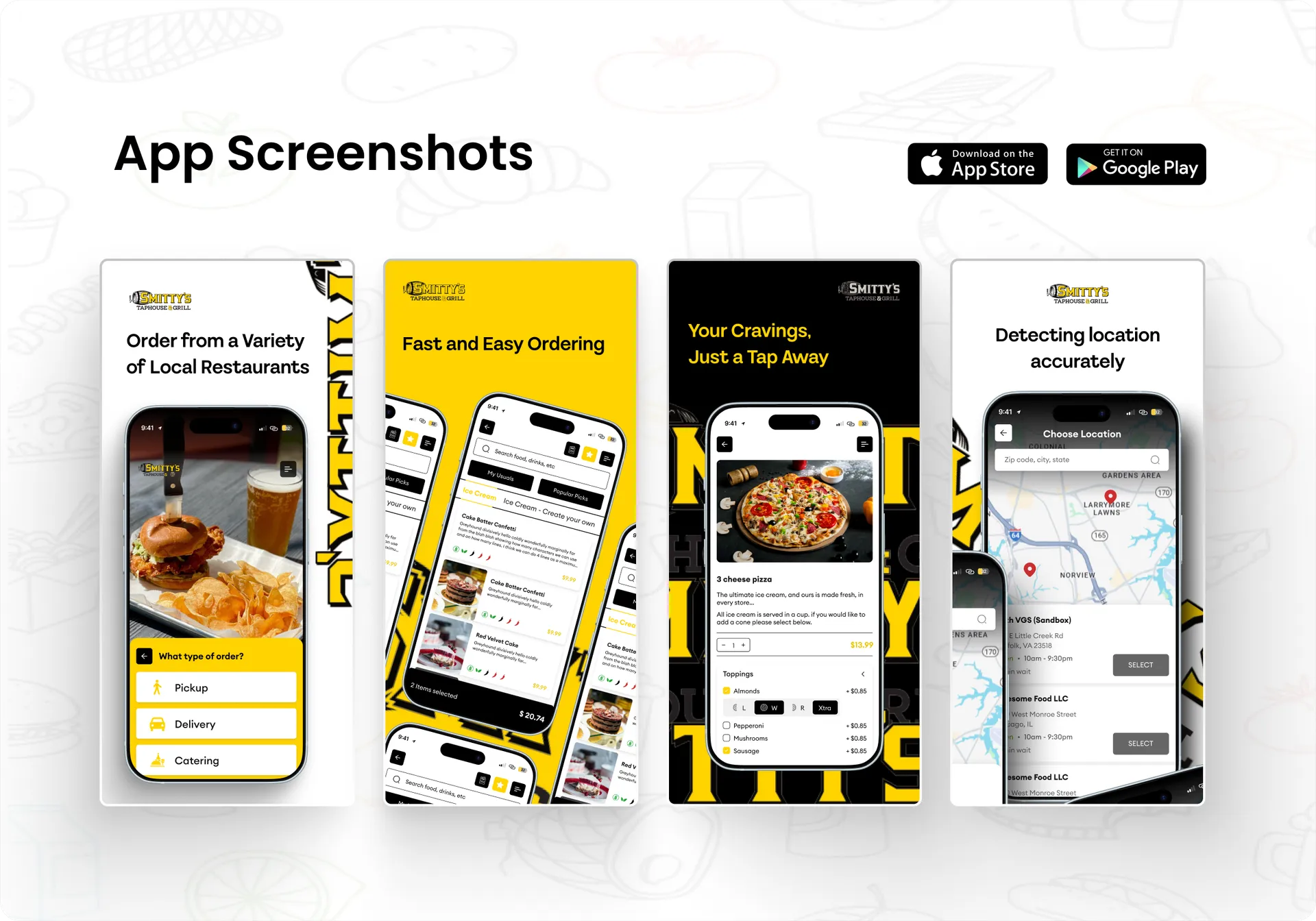 App Store Screenshots
The Smitty's Taphouse food ordering app design turns local restaurant discovery, menu browsing, and checkout into a fast, tap-light flow built for hungry users on the move. Smitty's Taphouse & Grill connects diners to a variety of local restaurants, so the app-store screens had to sell speed and ease before install. We designed a bold, appetite-driven interface — accurate location detection, item detail with live toppings and pricing, and category browsing with usuals and popular picks — wrapped in a high-contrast black-and-yellow palette that matches the taphouse brand. The result is a mobile experience that reads as quick, local, and craveable. See more web design work on our design wall, or explore full design services. The Design Approach The Smitty's Taphouse food ordering app design leads with imagery and momentum. Each app-store frame pairs a bold headline with a real screen: a map-based location picker with store cards, an item detail with quantity, toppings, size, and live price, and a search-and-browse feed with My Usuals and Popular Picks tabs. We kept typography clean and buttons large for one-handed use, used yellow as the action color against deep black, and let the food photography carry the emotional pull while menus stay legible. Pages We Designed Core flows covered a map-based location picker with store cards, hours, and select actions, a product detail screen with quantity, toppings, size, and live price, and a search-and-browse feed with My Usuals and Popular Picks tabs and category filtering. Together they map the full journey from "where do I get it" to "what do I want," each screen framed inside an app-store marketing layout with a headline that states the benefit up front. Key Outcomes Surfaced The screens position Smitty's Taphouse as fast, local, and easy the moment a shopper hits the listing. Accurate location detection signals reliability; live toppings and pricing build trust before checkout; usuals and popular picks speed repeat orders. The consistent black-and-yellow system and large imagery make the app feel premium and appetizing, giving the store listing a clear, benefit-led narrative across every frame. Built to Convert The Smitty's Taphouse food ordering app design is built to convert browsers into orders across the App Store and Play Store. Benefit-first headlines, appetizing photography, and low-friction flows push installs and repeat use. Built in Figma for pixel-tight handoff, the screens stay sharp across device sizes, so Smitty's Taphouse shows up polished from the first store thumbnail to the final checkout tap.
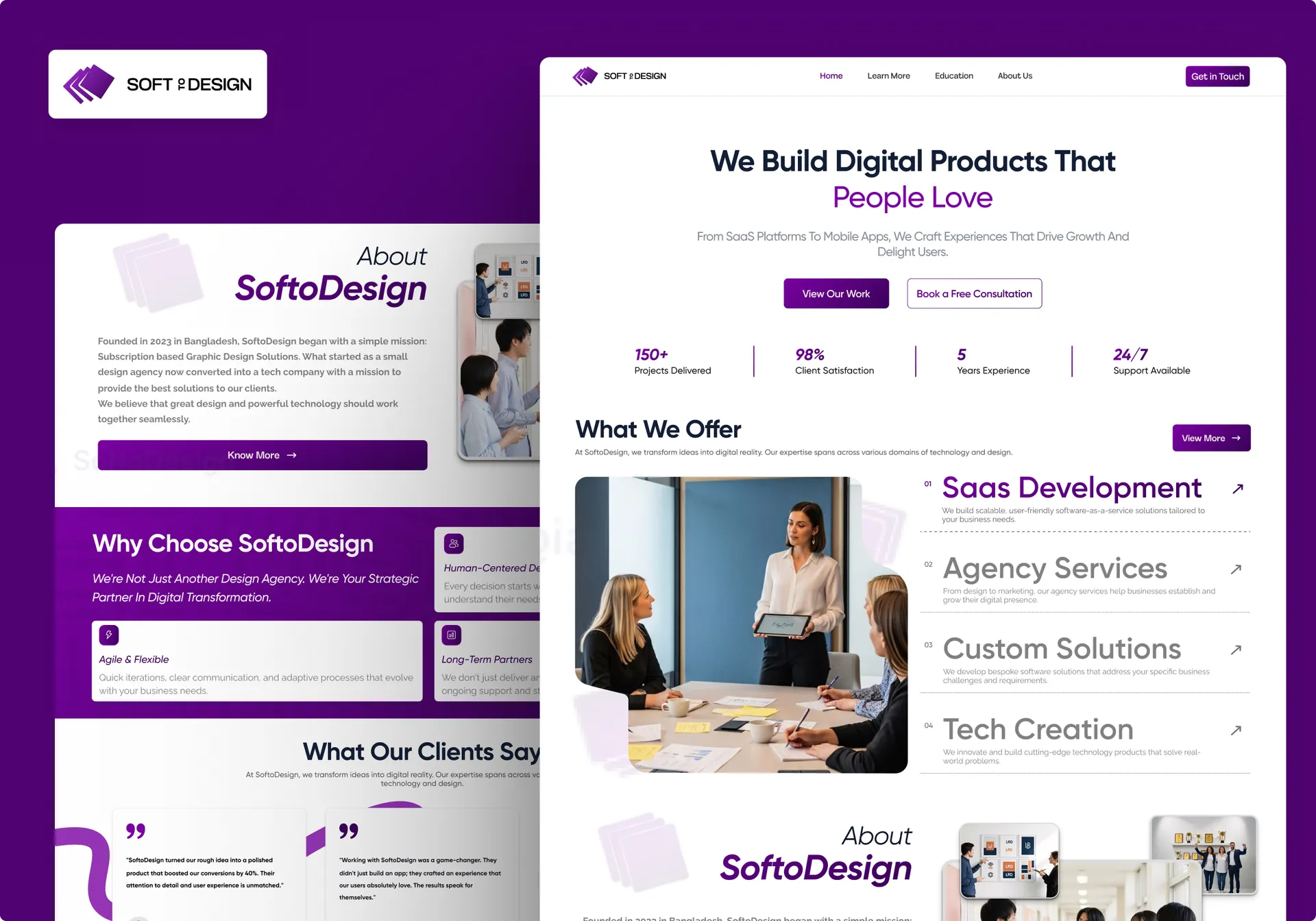 Website Designs
This digital agency website design gives SoftoDesign two distinct routes to the same pitch: a bold dark cyberpunk variant and a clean light variant, both selling SaaS and product work. The brief was one identity, two moods — let the agency test a high-drama neon treatment against an approachable, conversion-safe layout without rebuilding structure. We designed a shared section system so either skin drops onto the same content spine — see more web design work or explore our full design services. The Design Approach The dark variant leans into spectacle: oversized outlined display type, chrome-and-neon 3D hero props, deep black canvas, and violet glow accents that pull the eye down the page. The light variant keeps the same purple brand signal but trades drama for trust — white space, soft cards, photography of real teams, and clear button hierarchy. Across both, the digital agency website design holds one type scale and one accent purple, so the brand reads consistent whether a visitor wants edge or ease. Pages We Designed Both variants run a full single-page agency flow. A hero with dual value-prop and primary CTA opens, followed by a numbered Expertise/Offer block covering SaaS Development, Agency Services, Custom Solutions, and Branding or Tech Creation. Below sit a stats band (150+ projects, 98% satisfaction, 5 years, growth rate), an Our Works showcase, an About section, client testimonials, an expandable FAQ, and a closing "Ready to transform your ideas" conversion block with footer nav. Key Outcomes Surfaced The design front-loads proof and routes every section toward contact. Stats sit high to establish credibility before the pitch deepens. Numbered service cards make the offer scannable; testimonials carry names and roles for trust. The FAQ defuses the common objections — timeline, support, security, integration, pricing — right before the final CTA. Both variants repeat "Get in Touch" so the path to a conversation is never far from view. Built to Convert The result is one agency site with two sellable personalities, ready for A/B testing without a second build. Consistent CTAs, a proof-led structure, and a clean FAQ-to-contact funnel keep the page working toward booked calls. Built on a modern responsive stack with React , the design scales cleanly from hero spectacle to footer. Want this kind of range for your agency or product site? Reach us at hello@craxinno.com or craxinno.com.
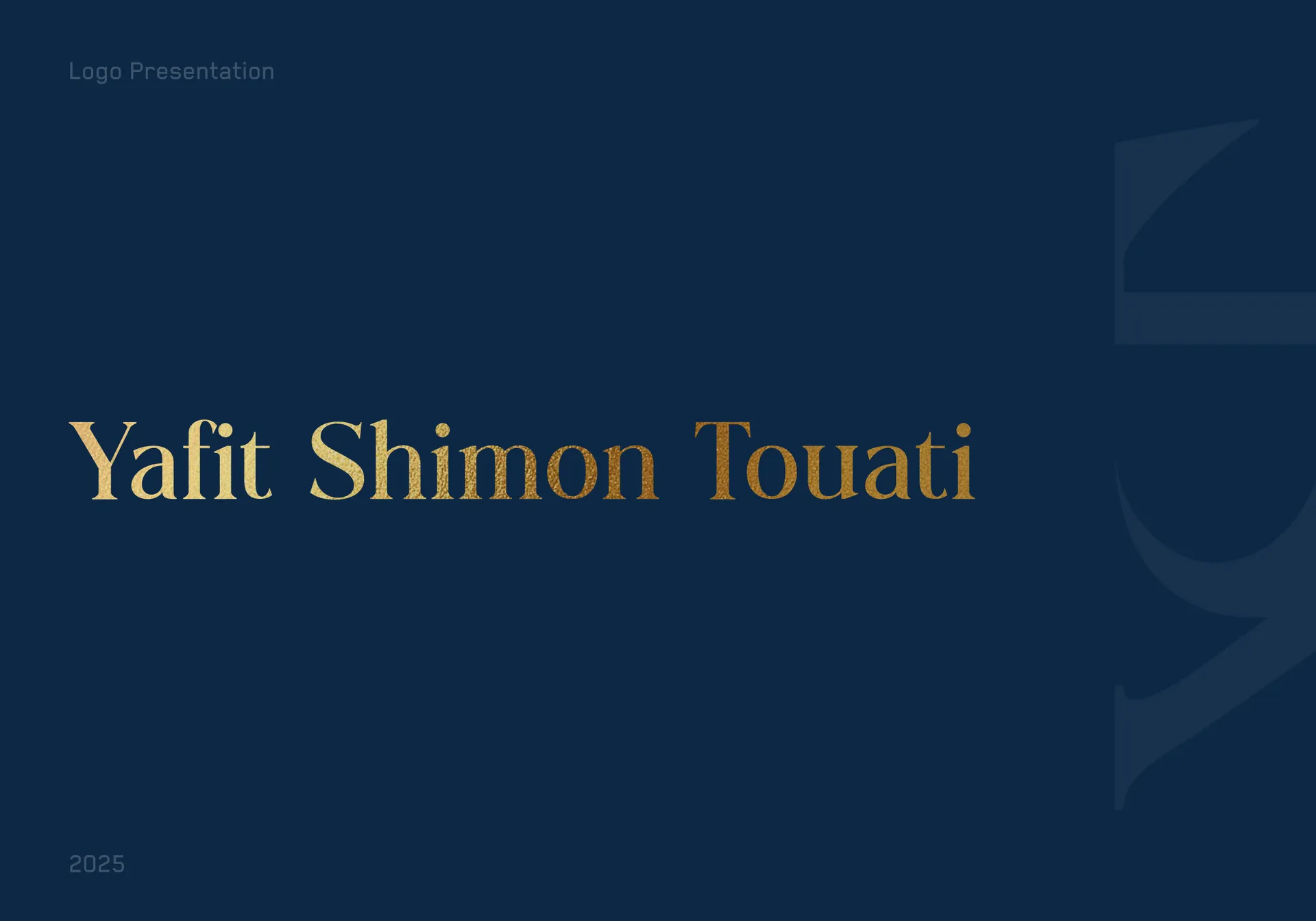 Logos
LogosThe law firm logo design for Yafit Shimon Touati distills an attorney's practice into a single gold monogram that reads with quiet authority. A legal brand has to signal trust, precision, and prestige before a word is read, so the brief was a mark that feels established yet personal. We built an interlocking YST ligature in a refined serif, finished in gold foil against deep navy, with a bilingual English and Hebrew wordmark beneath. The result is an identity that looks equally right on a business card, a letterhead, or an office door. See more of our web design work for related brand systems. The Design Approach We led with restraint and craft. The law firm logo design centres a custom YST monogram where the three letterforms share strokes, so the mark feels unified rather than assembled. A high-contrast serif carries tradition and legal gravity; gold foil signals premium standing without shouting. We anchored the system on navy for authority and a warm cream for softer applications, then set the founder's name in a clean serif lockup with a Hebrew line beneath for the firm's bilingual audience. A construction grid keeps every proportion deliberate. What We Delivered A complete primary identity. The build includes the gold YST monogram, a stacked name lockup with English and Hebrew wordmarks, a construction grid defining spacing and proportion, and three background treatments — navy, cream, and neutral — so the mark holds up across print and screen. Each variant preserves the same balance of monogram, rule line, and bilingual name. Key Outcomes Surfaced The design earns instant credibility: a gold-on-navy serif monogram reads as established and trustworthy, exactly what a legal client looks for. The shared-stroke ligature makes three initials feel like one considered mark, memorable at any size. Bilingual wordmarks let the firm speak to both English and Hebrew audiences without a second logo. Multiple background treatments keep the identity consistent from foil business card to digital header. Built to Represent For a personal legal brand, success is recognition and trust — clients remembering the mark and associating it with authority. A disciplined monogram, premium gold, and a bilingual lockup all give the practice a professional face that scales across every touchpoint. Explore our full design services to scope a custom brand identity for your firm.
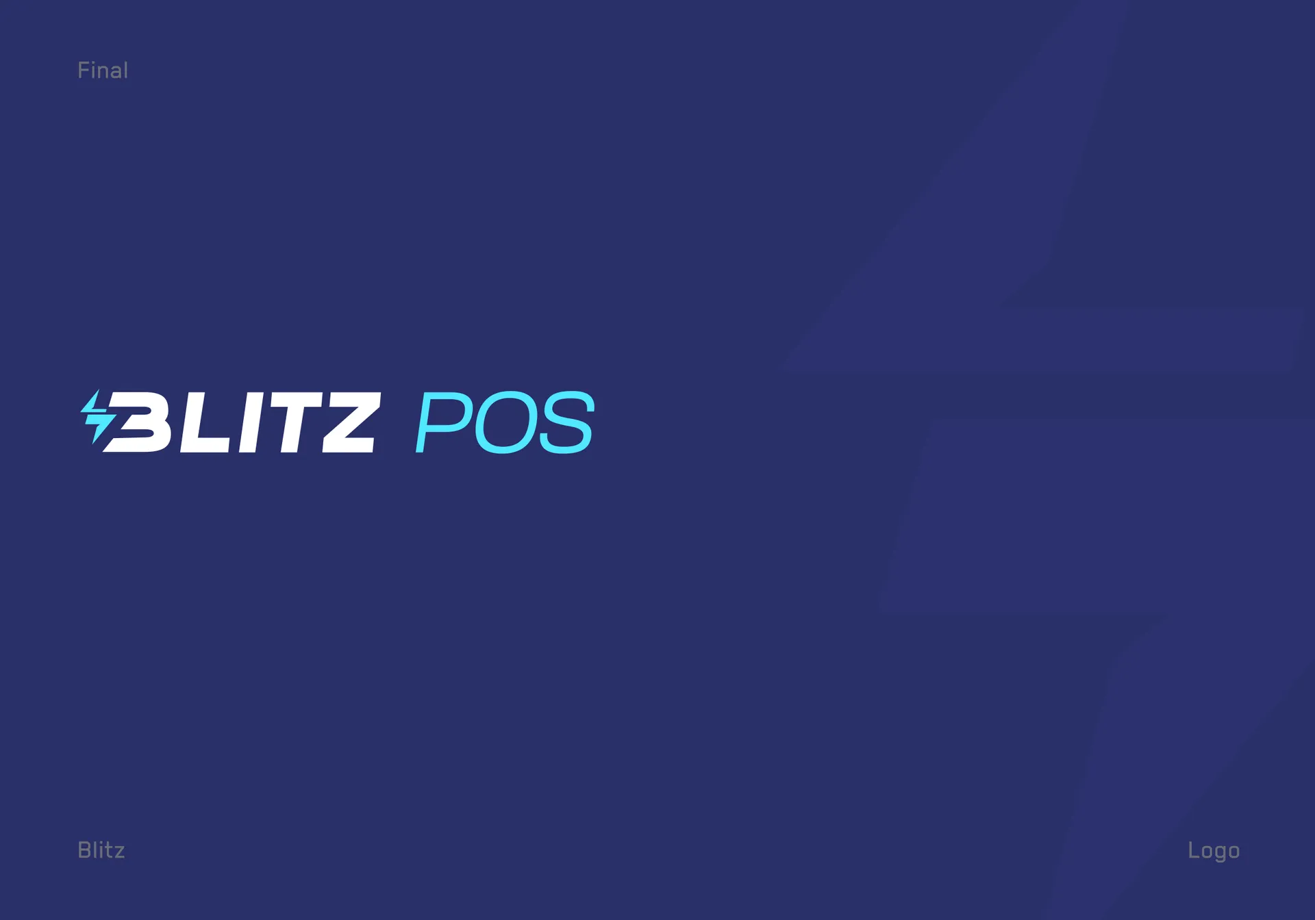 Logos
LogosThe Blitz POS logo design fuses a lightning bolt with a credit card to give a point-of-sale platform a mark that signals speed and payment in one glance. Blitz POS processes transactions fast, so the identity had to feel instant — energetic, sharp, unmistakably fintech. We built the mark by combining two ideas, a thunderbolt and a swipe card, into a single geometric symbol that locks up with a bold italic wordmark. The result is a confident, high-velocity identity built for retail speed. See more web design work on our design wall, or explore full design services . The Design Approach The Blitz POS logo design started from two source concepts held side by side. A thunderbolt carried the "blitz" — raw speed and power. A credit card carried the "POS" — the transaction itself. We overlapped them so the negative space of the bolt reads as a card swipe, merging meaning and form into one mark. The italic, condensed wordmark leans forward to reinforce momentum, while the cyan-on-navy palette keeps the brand feeling electric, modern, and trustworthy for payments. What We Delivered The engagement produced a complete primary identity: the Blitz bolt-card monogram, the full horizontal lockup with the Blitz POS wordmark, and the exploration showing how thunder and credit-card forms fused into the final mark. We supplied the logo on a deep-navy field and in mono black for flexible use, plus the construction rationale so the brand extends cleanly across product, hardware, and marketing. Deliverables covered the logo presentation, the concept breakdown, and the final lockup. Key Outcomes Surfaced The identity gives Blitz POS a mark that works from terminal screen to app icon to signage without losing energy. The bolt monogram alone carries the brand, while the lockup delivers the full name where space allows. The dual-meaning concept — speed plus payment — ties the visual straight to the product promise, so customers read "fast checkout" before they read a word. The italic wordmark keeps the whole system feeling quick and premium. Built to Represent The Blitz POS logo design is built to represent a fast payment platform across POS hardware, mobile apps, and retail marketing. The bolt-and-card motif carries the "instant transaction" idea onto any surface — terminal boot screens, receipts, app stores, storefront decals. Designed in Figma with vector refinement, the mark stays sharp from a favicon to a full storefront sign, giving Blitz POS one bold, ownable symbol that reads at a glance.
 Website Designs
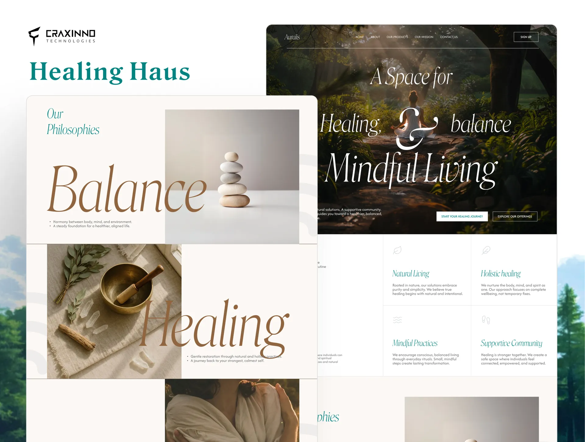
This wellness website design for Healing Haus & Co presents a holistic-healing brand offering yoga, herbal medicine, and mindful consultation. We explored two homepage directions for the same brand — a calm, editorial green-led layout and a bolder, serif-driven concept with full-bleed nature imagery. Both feel grounded, natural, and human. The Design Approach A green-and-earth palette signals nature, calm, and healing. Elegant serif type carries a premium, editorial tone. Soft duotone photography of yoga, ritual, and nature sets a meditative mood. V1 leans structured and airy; V2 goes expressive with oversized "Balance / Healing / Mindfulness" typography and a marquee tagline. Two routes, one serene system. Pages We Designed The build centers on a full marketing homepage. It opens with a nature-led hero and rating bar. Shared sections include an About block, a values grid, a services section (yoga, herbal medicine, consultation), a "why choose us" grid, video testimonials, a contact form, and a social-media gallery. V2 adds a philosophy section and a community-join CTA. Key Outcomes Surfaced Trust markers sit high on the page: 4.9/5 rating, 2,000+ members, certified experts. Real testimonial cards with video add social proof. Every section reinforces a warm, credible wellness brand. Built to Convert Persistent "Start Your Reset," "Book a Free Consultation," and "Join the Community" CTAs guide visitors toward action. A contact form captures leads directly. See more of our web design work or our design services . Built for stacks using tools like Webflow .
 Website Designs
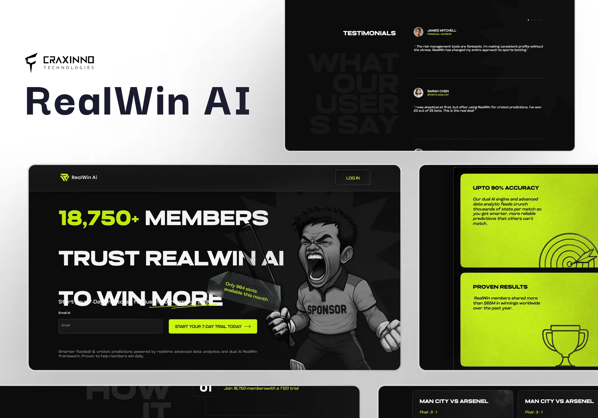
This sports prediction website design presents RealWin AI, an AI-driven match-prediction platform for football and cricket fans. We designed a bold, high-energy dark site that frames data and confidence scores as the hero while driving free-trial sign-ups across two distinct visual directions. The Design Approach We explored two routes on a shared dark foundation. One leans refined and analytical with subtle glows; the other goes loud with an acid-lime accent, oversized type, and illustrated mascot energy. Both use confidence-score badges, live-match cards, and accuracy stats to make the AI feel tangible. The contrast lets the client pick between trustworthy-premium and bold-viral. Pages We Designed The build covers a full marketing site. It spans the hero with trial capture, a why-choose feature grid, featured live-match cards for football and cricket, a three-step how-it-works flow, recent-results and accuracy panels, a leaderboard, tiered trial and VIP pricing, a testimonials wall, an FAQ accordion, and a final sign-up CTA. Key Outcomes Surfaced Trust markers anchor the pitch: accuracy percentages, member counts, confidence scores, and secure-payment cues. Side-by-side football and cricket coverage signals breadth. The leaderboard and testimonials add social proof; transparent trial pricing lowers the barrier to entry. Built to Convert Persistent "Start Your Trial" CTAs and inline email capture repeat down every page. Match cards funnel toward full-analysis views; pricing cards push trial-to-VIP upgrade. See more of our web design work or our design services . Built for stacks using tools like Next.js .
 App Store Screenshots
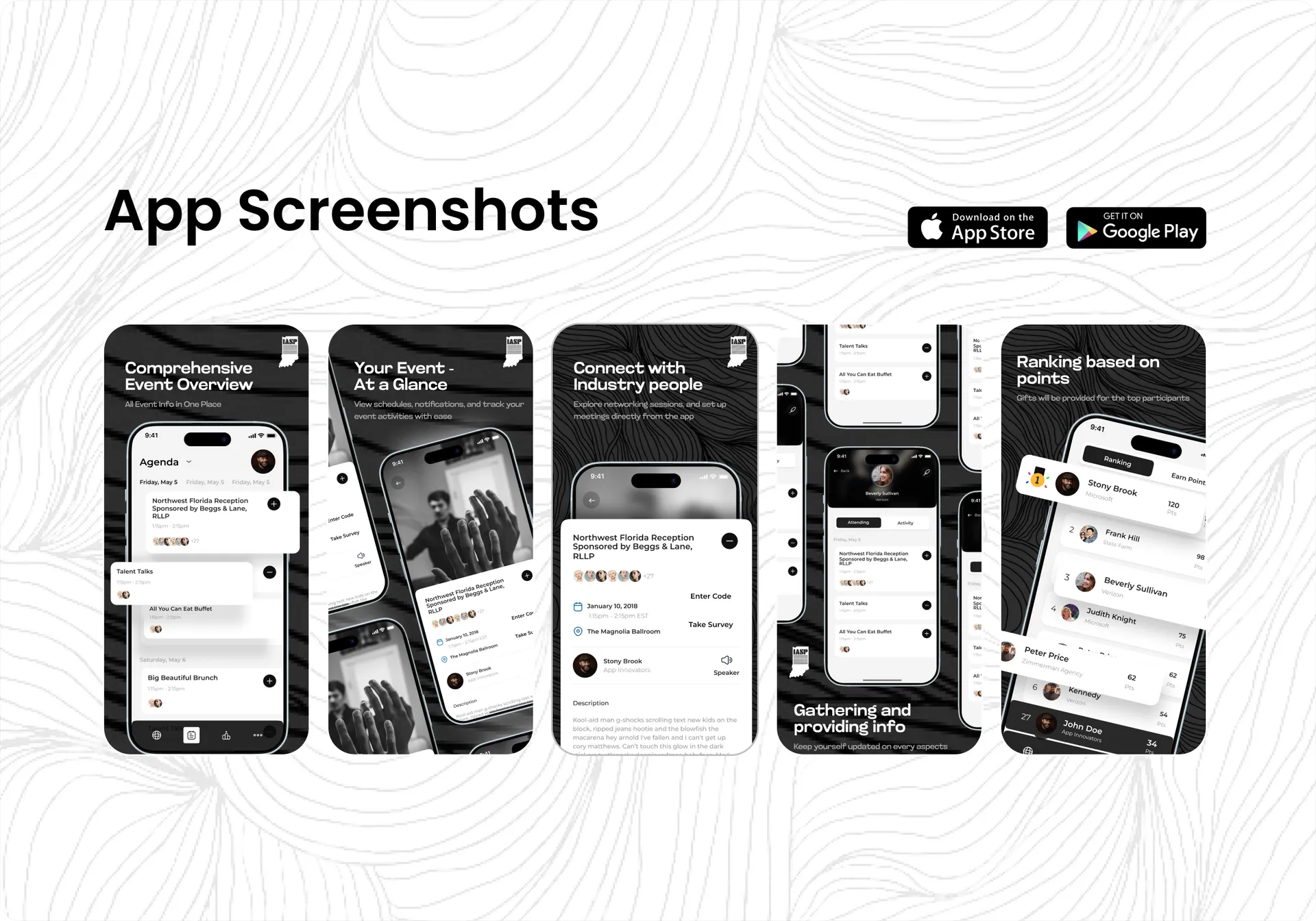
The IASP event app design pulls conference agendas, session detail, attendee networking, and activity tracking into one sharp, dark-themed mobile experience built for members on the floor. IASP runs a packed multi-day program, so the app-store screens had to surface schedule, sessions, and connections at a glance. We designed a high-contrast black-and-white interface — day-tabbed agendas, expandable session cards, speaker and survey actions, and attendee profiles — tuned for fast scanning in any lighting. The result is a mobile experience that feels premium, focused, and easy to work mid-event. See more web design work on our design wall, or explore full design services . The Design Approach The IASP event app design leads with contrast and clarity. Each app-store frame pairs a bold headline with a real screen: an agenda with day tabs and expand/collapse session cards, a session detail view with date, time, venue, speaker, Enter Code and Take Survey, and an attendee profile with Attending and Activity tabs. We used deep black grounds with crisp white cards so time slots and CTAs read instantly, and let the monochrome system feel editorial and high-end. The IASP shield marks every marketing frame. Pages We Designed Core flows covered the Agenda with day tabs (Friday May 5, Saturday May 6) and expandable session cards, a session detail screen with date, time, venue, speaker, Enter Code and Take Survey actions, and an attendee profile with Attending and Activity tabs listing sessions joined. Together they map the full member journey — browse, plan, attend, connect — each framed inside an app-store layout with a benefit-led headline stating the value up front. Key Outcomes Surfaced The screens position IASP as an organized, high-touch event the moment a member opens the listing. Expandable agenda cards keep the day scannable; session detail with surveys drives feedback; attendee profiles make networking tangible. The high-contrast black-and-white system makes the app feel premium and editorial, giving the store listing a clear, benefit-led narrative across every frame. Built to Convert The IASP event app design is built to convert members into active daily users across the App Store and Play Store. Benefit-first headlines, a bold monochrome palette, and engagement hooks like surveys and activity tracking push installs and repeat opens. Built in Figma for pixel-tight handoff, the screens stay sharp across device sizes, so IASP shows up polished from the first store thumbnail to the final session tap.
Showing 15 of 71 shots