© 2026 — Craxinno Technologies



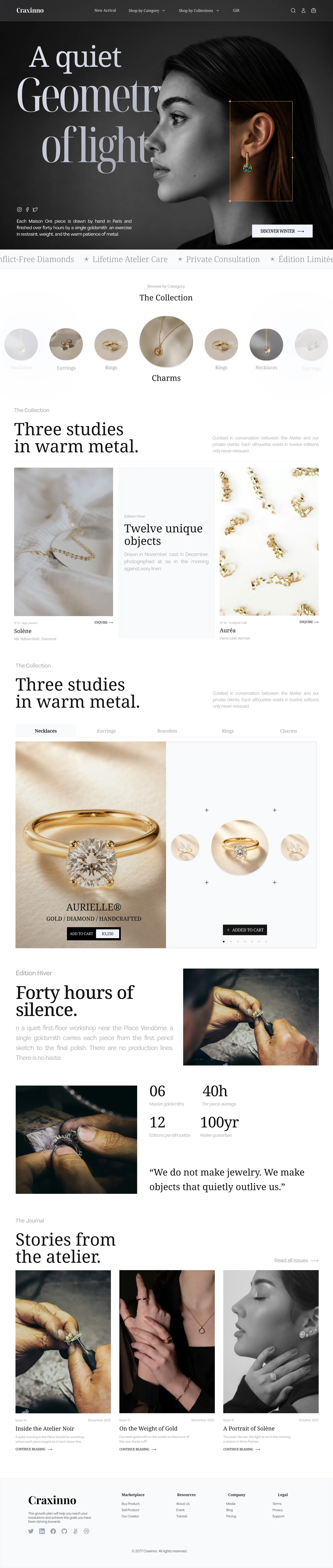
This luxury jewelry ecommerce design gives a high-end atelier brand a quiet, editorial storefront that sells craft over clutter. The brief was to make fine jewelry feel collectible, not transactional — generous whitespace, serif typography, and slow, gallery-style product photography that lets each piece breathe. We designed a cream-gold-and-black system spanning home, category, product, cart, and checkout, where the storytelling and the buy path carry equal weight — see more web design work or explore our full design services.
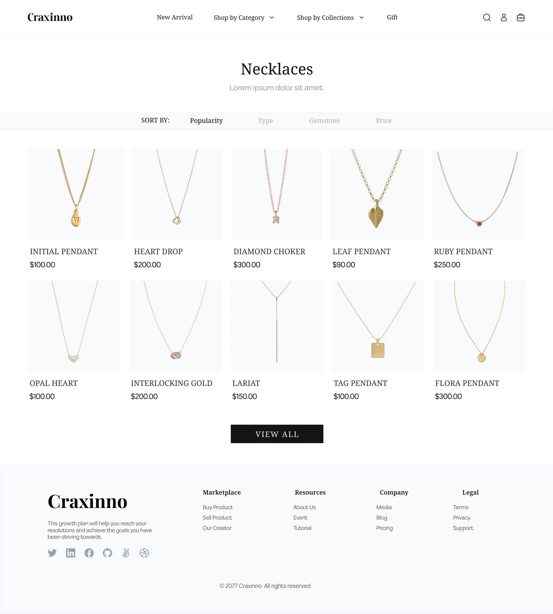
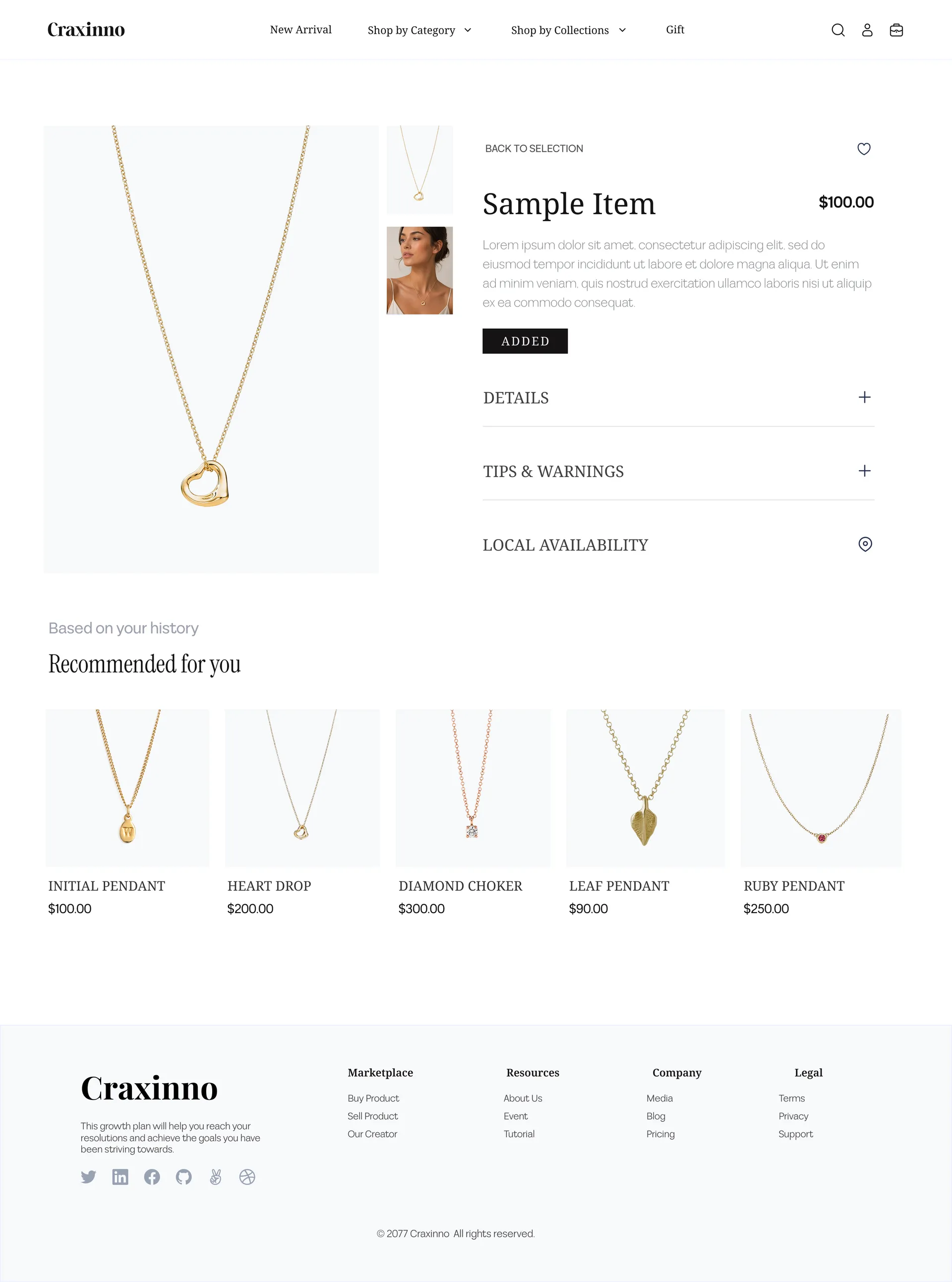
The direction is restrained and gallery-like: an off-white canvas, warm gold accents, a classic serif display face, and editorial layouts that treat each necklace like a museum object. Generous margins and large imagery slow the eye; black buttons and clear pricing keep the commerce unmistakable. Atelier storytelling — "forty hours of silence," master-goldsmith stats — builds desire before the cart. Across every screen, the luxury jewelry ecommerce design balances editorial mood with frictionless shopping.
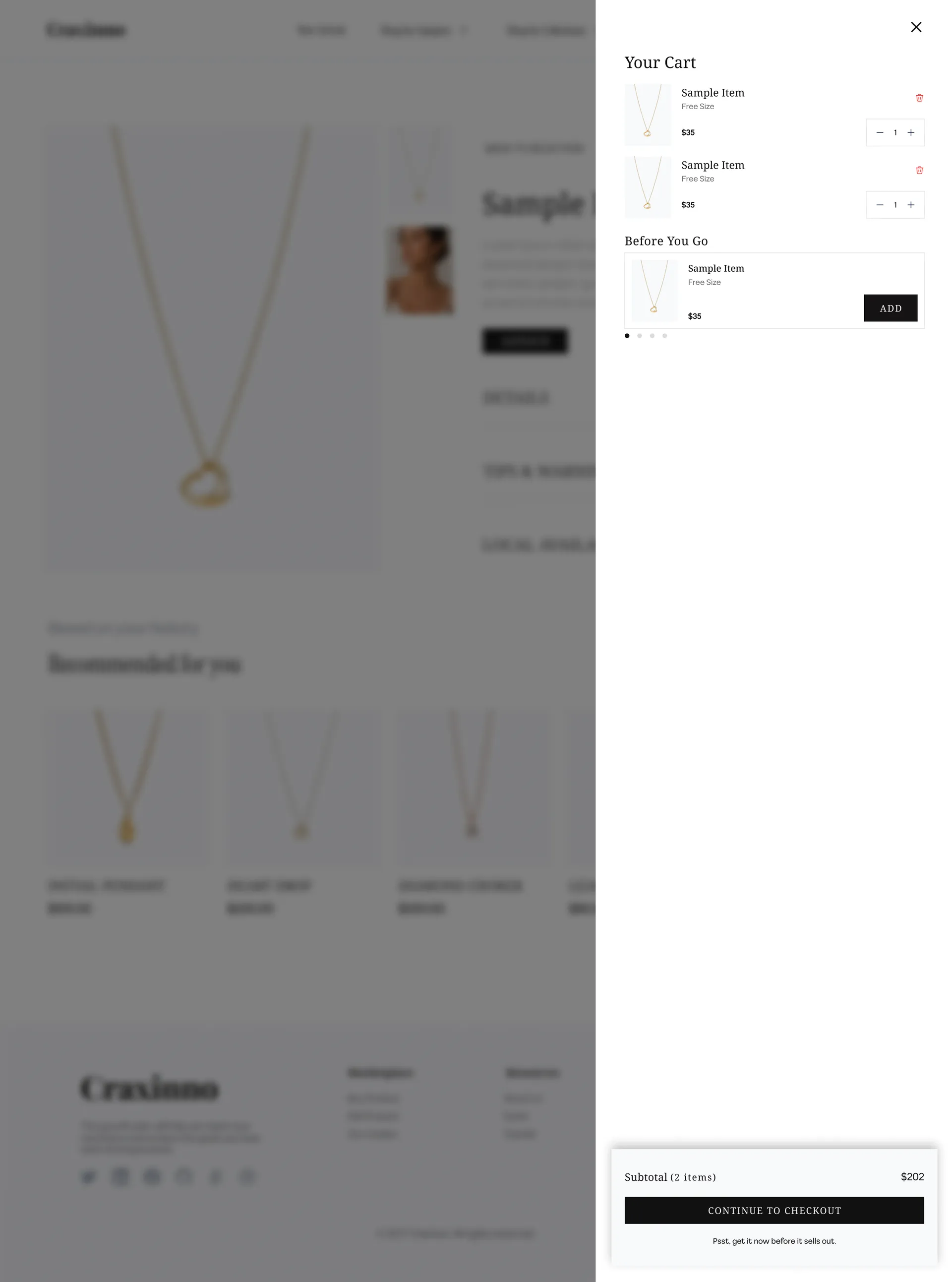
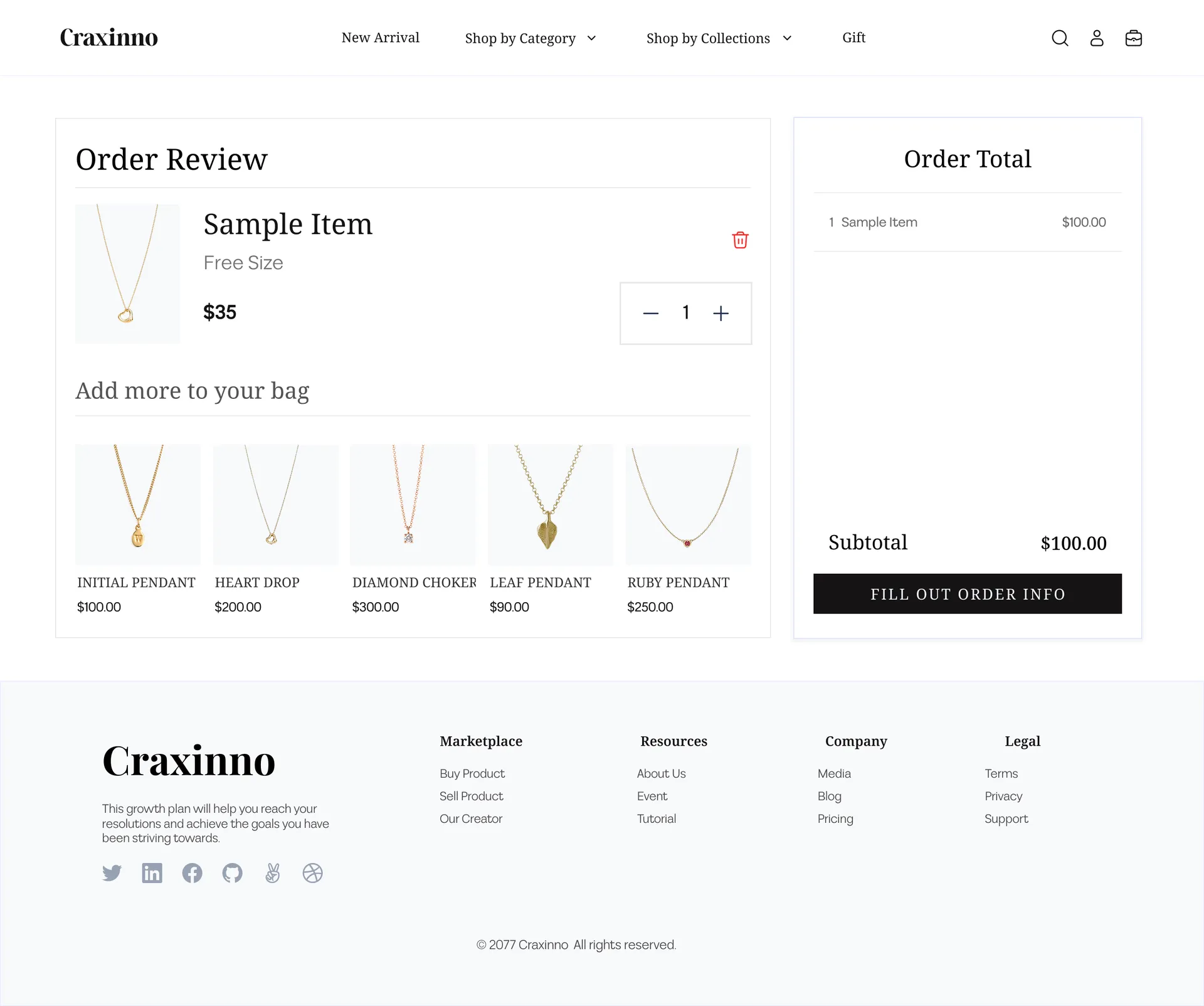
The store spans the full purchase journey. A Home page opens with a quiet hero, a category carousel, edition storytelling, an add-to-cart product showcase, atelier stats, and a journal grid. A category page lists products with sort controls and a clean grid. A product page pairs gallery imagery with details, tips, local availability, and recommendations. A slide-in cart with upsells and a full Order Review and checkout summary close the loop.
The design sells through restraint. Editorial storytelling and atelier stats build perceived value before price ever appears, so the buyer feels craft, not cost. Product grids stay calm with one image, name, and price — no badge noise. The slide-in cart adds upsells without leaving the page, and the order review keeps "add more to your bag" recommendations alive right up to checkout. Every step nudges toward purchase while protecting the luxury feel.
The result is a jewelry store that feels like a gallery but checks out like modern commerce — editorial enough to covet, clear enough to buy. Slow storytelling, calm product grids, and an upsell-aware cart keep desire and conversion working together. Built on a modern responsive stack with React, the design scales cleanly from editorial hero to checkout summary. Want this kind of polish for your store or brand? Reach us at hello@craxinno.com or craxinno.com.