© 2026 — Craxinno Technologies



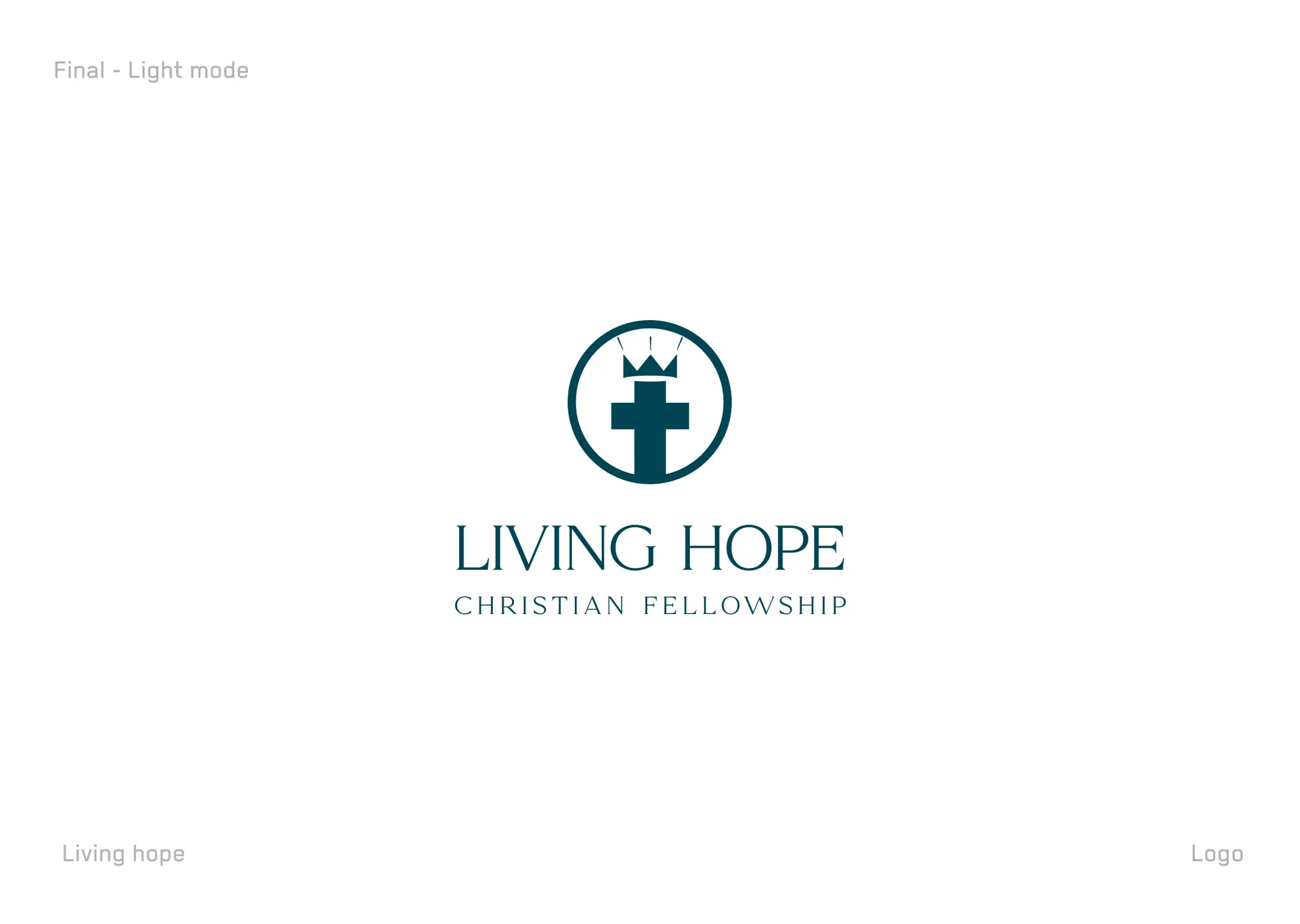
The church logo design for Living Hope Christian Fellowship gives a congregation a calm, timeless mark rooted in faith. A church brand has to feel welcoming and reverent at once, so the brief was a symbol that reads instantly as Christian yet feels contemporary and warm. We built a cross topped with a crown inside a clean circle — Christ the King — paired with an elegant serif wordmark and a spaced "Christian Fellowship" line. Deep teal carries calm, trust, and quiet dignity. The result is an identity that looks right on a church sign, a bulletin, or a Sunday slide. See more of our web design work for related brand systems.
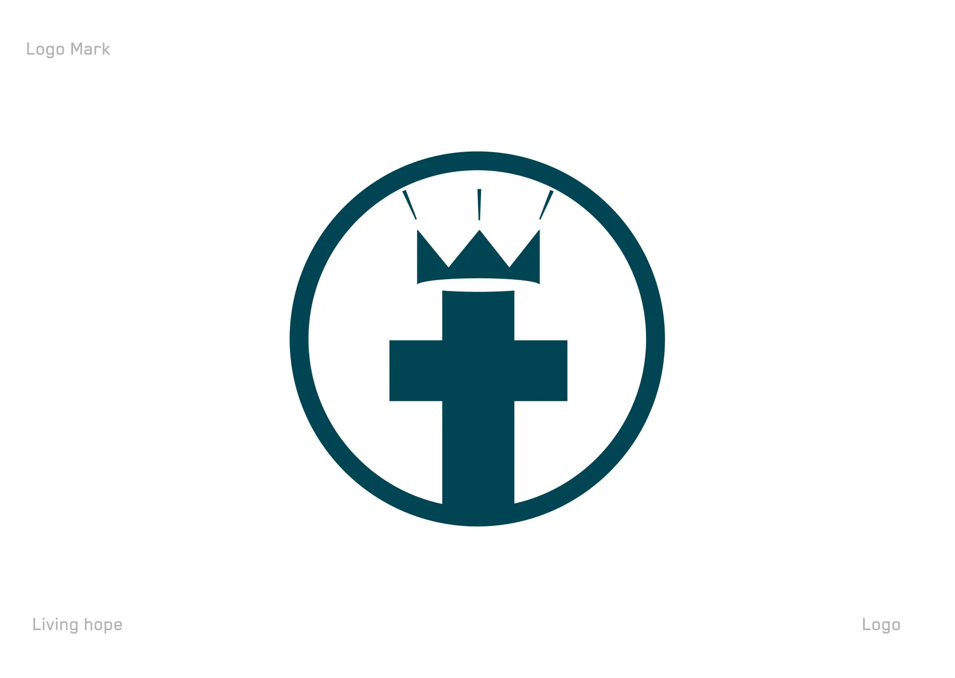
We led with meaning and warmth. The church logo design centres a cross-and-crown symbol — the crown signalling Christ as King, the cross signalling faith and sacrifice — held in a simple circle for unity and community. We chose a refined serif for the name to carry tradition and grace, then set the tagline in wide letter-spacing for a calm, welcoming rhythm. A single deep-teal palette keeps the identity serene rather than loud, and dark and light variants let the mark hold on a teal banner or a white page.
A complete primary identity. The build includes the cross-and-crown circular logomark, a stacked wordmark lockup with the "Christian Fellowship" tagline, a horizontal version, and dark and light background treatments. Each variant preserves the same symbol proportion, serif wordmark, and calm teal tone across print and screen.
The design communicates faith instantly: the cross-and-crown mark reads as Christ the King without a word, giving the church an emblem members recognise and trust. The refined serif signals warmth and tradition, welcoming rather than institutional. The circular containment suggests community and belonging. Dark and light variants keep the identity consistent from outdoor signage to a printed bulletin, and a standalone logomark works as an app icon or social avatar.
For a church, success is belonging — members and visitors feeling this is a place of hope. A meaningful symbol, a serene palette, and flexible variants give Living Hope a face that scales across signage, print, and screen. Explore our full design services to scope a custom brand identity for your organization.