© 2026 — Craxinno Technologies



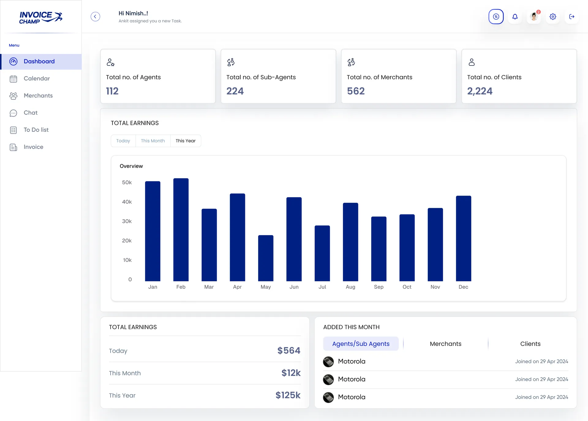
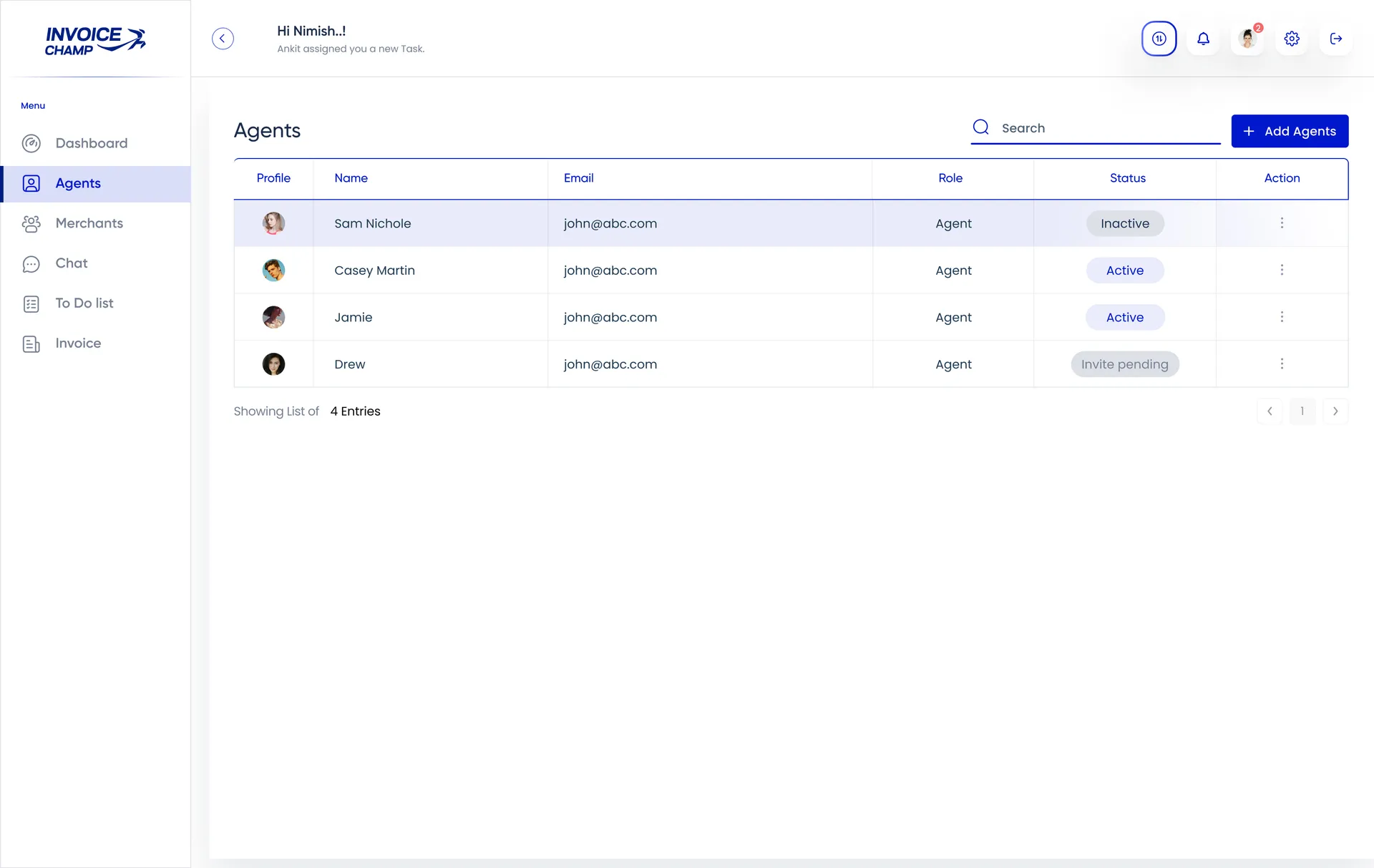
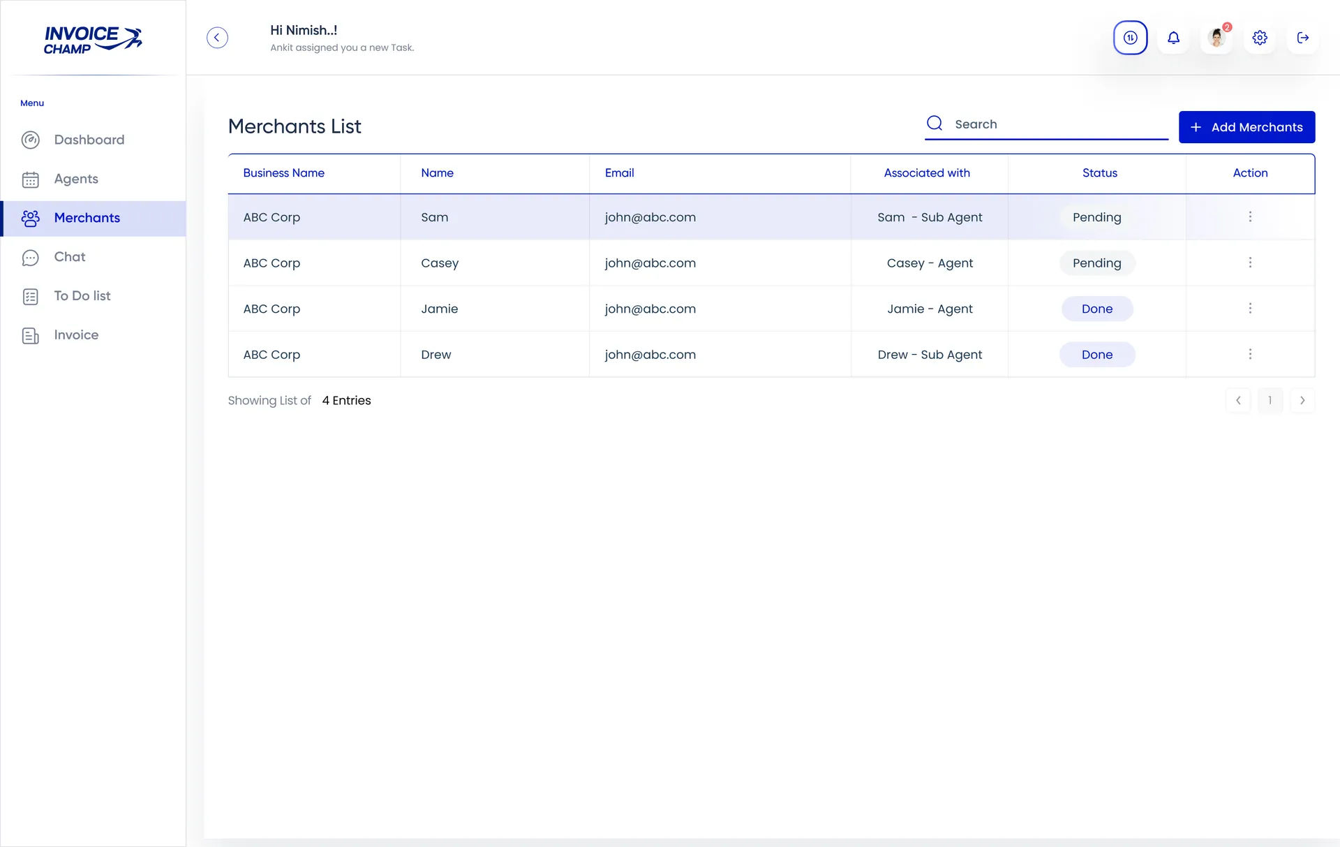
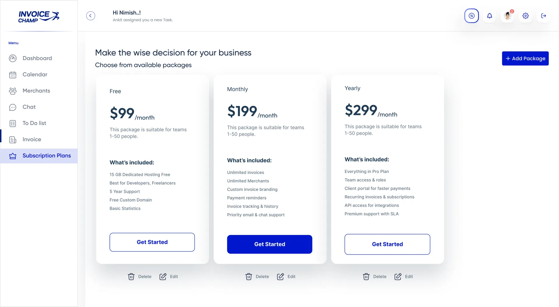
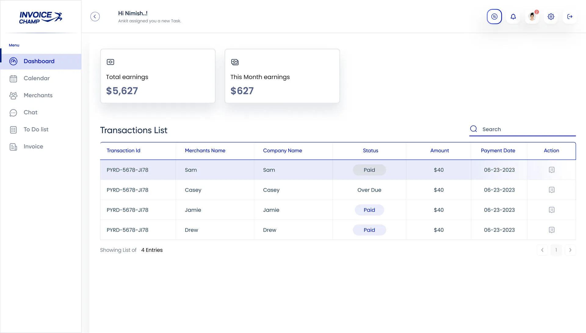
This invoicing SaaS dashboard UI design gives a payments platform a crisp, confident admin for managing agents, merchants, and earnings at scale. The brief was to make a multi-tier billing operation feel effortless — clean navy-and-indigo system, clear stat cards, a readable earnings chart, and tables that turn agent management into a few quick actions. We designed a system spanning a metrics dashboard and an agent-management view, where operational oversight and day-to-day usability carry equal weight — see more web design work or explore our full design services.
The direction is sharp and fintech-clean: a bright canvas, a deep navy brand with indigo accents, rounded stat cards, and a persistent left sidebar that keeps modules one click away. A bold monthly earnings bar chart anchors the dashboard, while status pills (Active, Inactive, Invite pending) make agent states instantly scannable. Avatars, search, and tidy pagination keep dense tables friendly. Across every view, the invoicing SaaS dashboard UI design balances data depth with calm, decisive clarity.
The platform spans the core admin loop. A Dashboard surfaces headline counts — agents, sub-agents, merchants, clients — above a twelve-month earnings overview chart, a today/month/year earnings breakdown, and an "added this month" tabbed list across agents, merchants, and clients. An Agents screen lists team members with profile, email, role, and status in a clean table, with search, add-agent, and per-row actions for fast management.
The design runs the business through clarity. Top-line stat cards give instant scale — how many agents, merchants, and clients are live — while the earnings chart turns a year of revenue into one glance. Status pills across the agent table make onboarding and access states obvious, cutting admin guesswork. Tabbed "added this month" tracking and a clear today/month/year split keep growth and cash flow visible, so operators act on real numbers fast.
The result is an invoicing platform that feels enterprise-capable yet easy to drive — rich in metrics, calm in layout. Headline stats, a clear earnings chart, and scannable agent states keep oversight and usability working together. Built on a modern responsive stack with React, the design scales cleanly from KPI cards to management tables. Want this kind of clarity for your platform or admin product? Reach us at hello@craxinno.com or craxinno.com.