© 2026 — Craxinno Technologies



This fashion ecommerce website design gives a premium apparel brand a calm, editorial storefront that sells quality over hype. The brief was to make timeless menswear feel considered, not fast-fashion — restrained typography, full-bleed lookbook photography, and a buy path that stays clear from hero to checkout. We designed a warm-neutral-and-black system spanning home, category listing, product detail, cart, wishlist, and login, where editorial mood and conversion carry equal weight — see more web design work or explore our full design services.
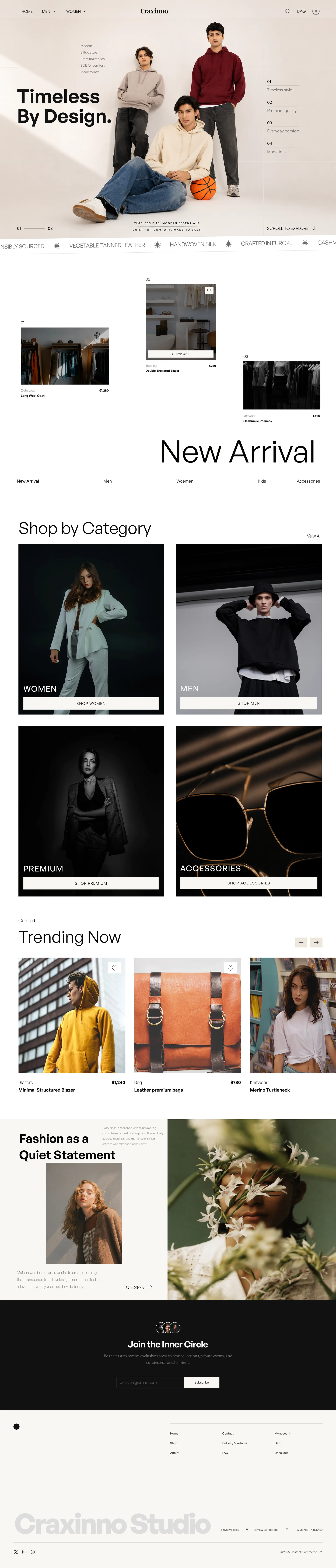
The direction is modern and editorial: a soft off-white canvas, deep black type, a clean sans display face, and large lifestyle imagery that frames each garment like a campaign. Generous whitespace and a steady grid slow the browse; black buttons and clear strike-through pricing keep the commerce obvious. A "Timeless by design" hero, category tiles, and trending carousels build a fashion mood before the filters. Across every page, the fashion ecommerce website design balances campaign feel with frictionless shopping.
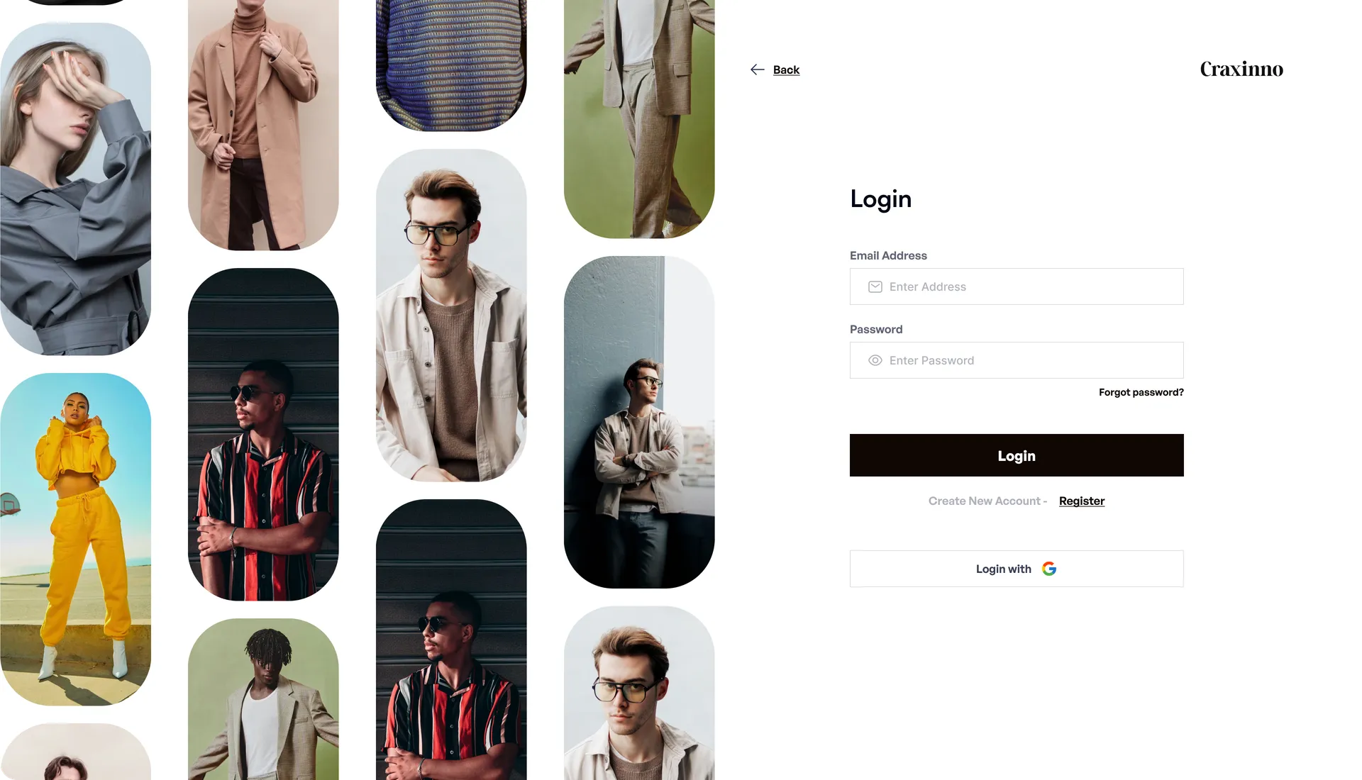
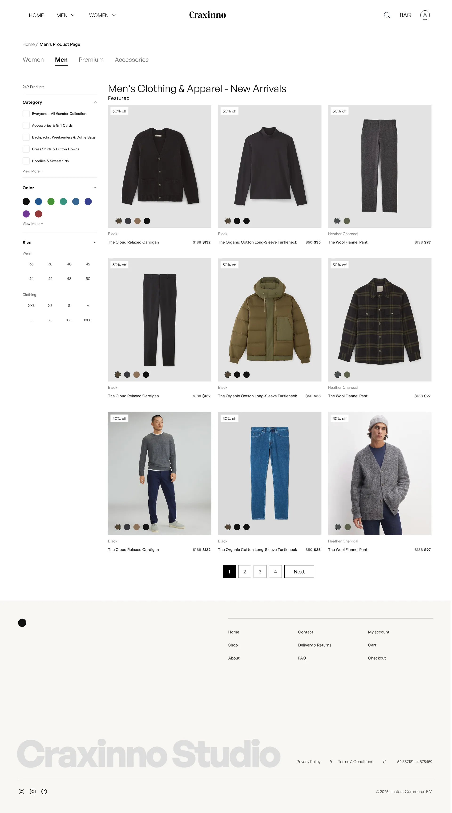
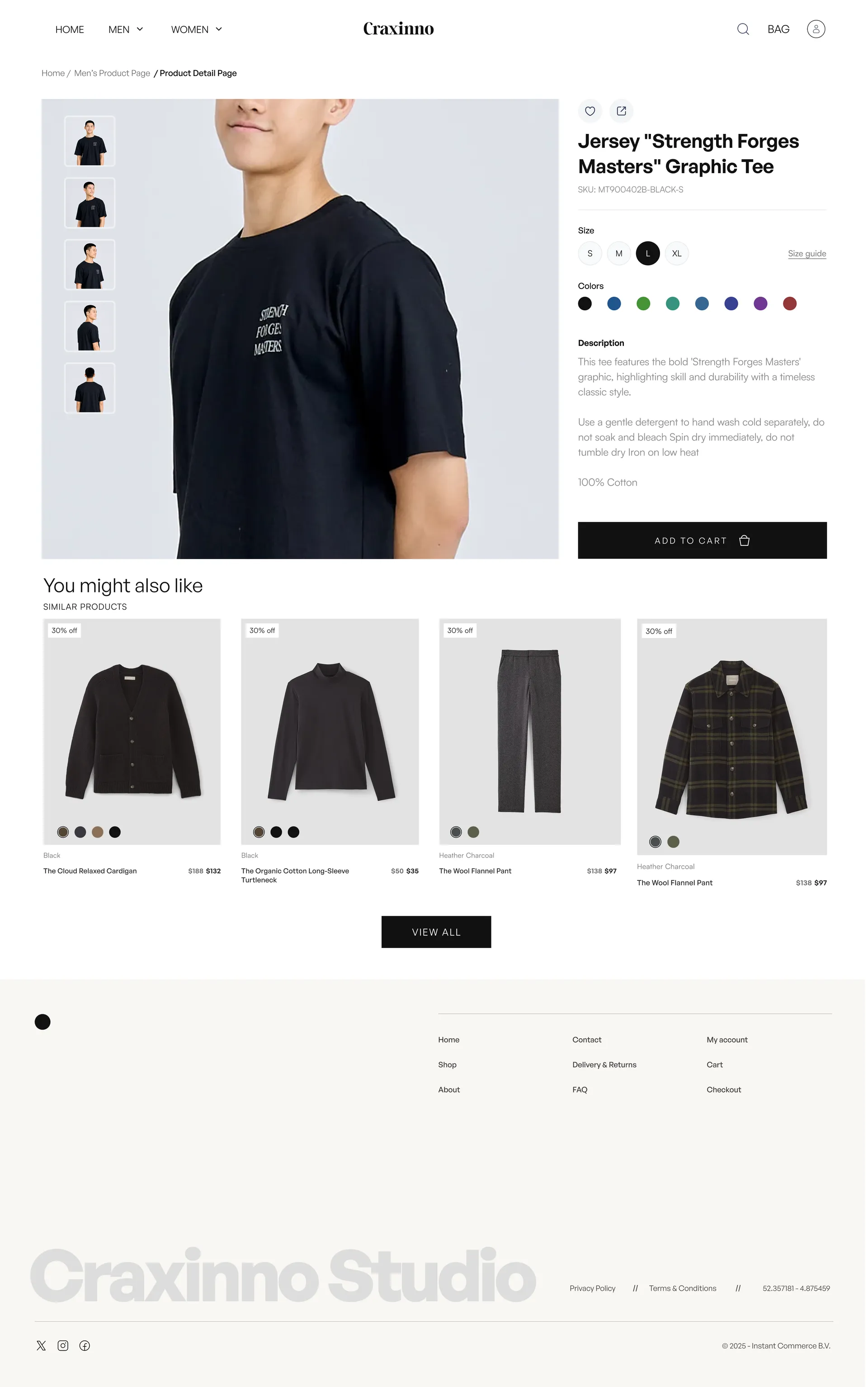
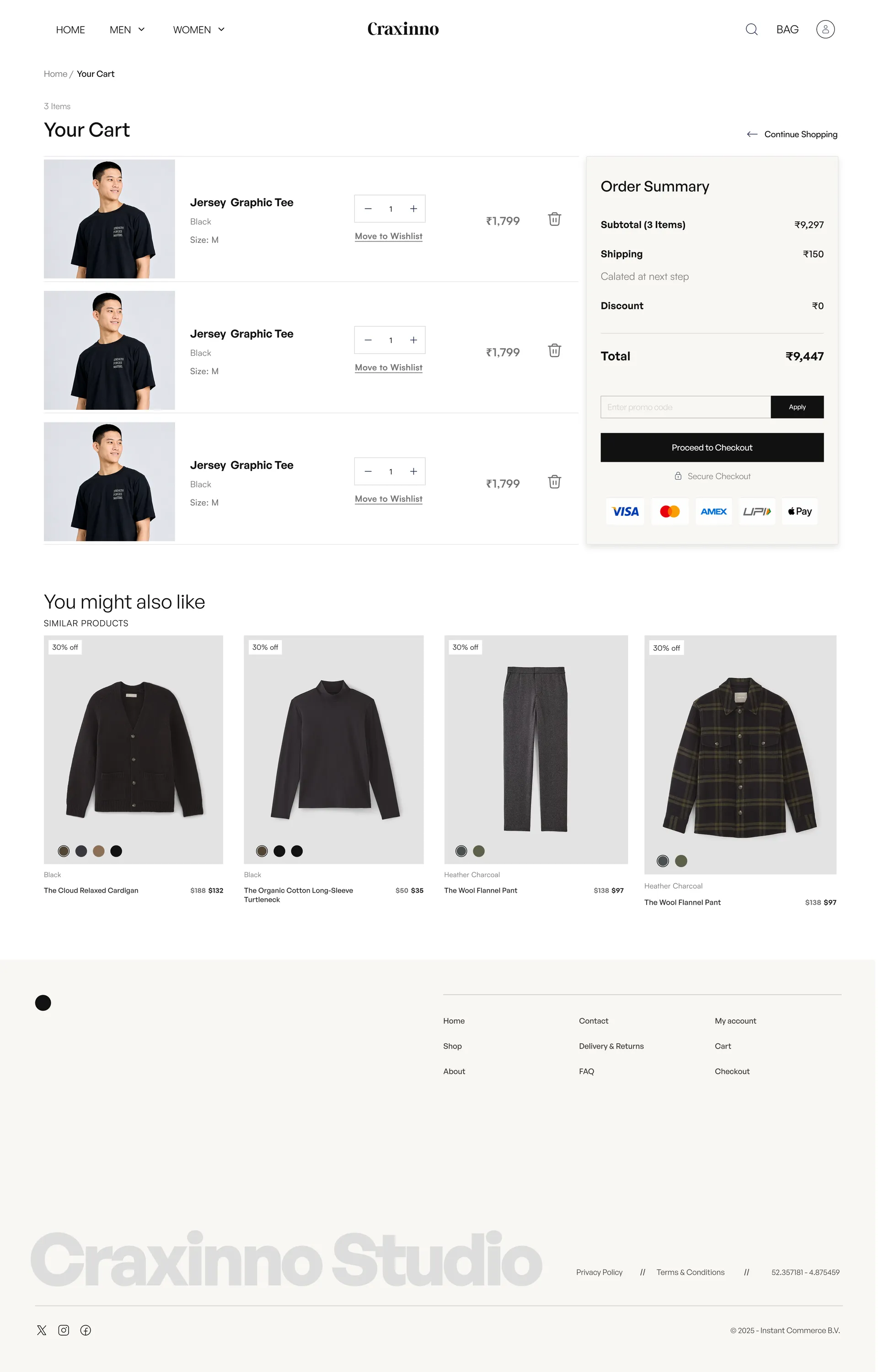
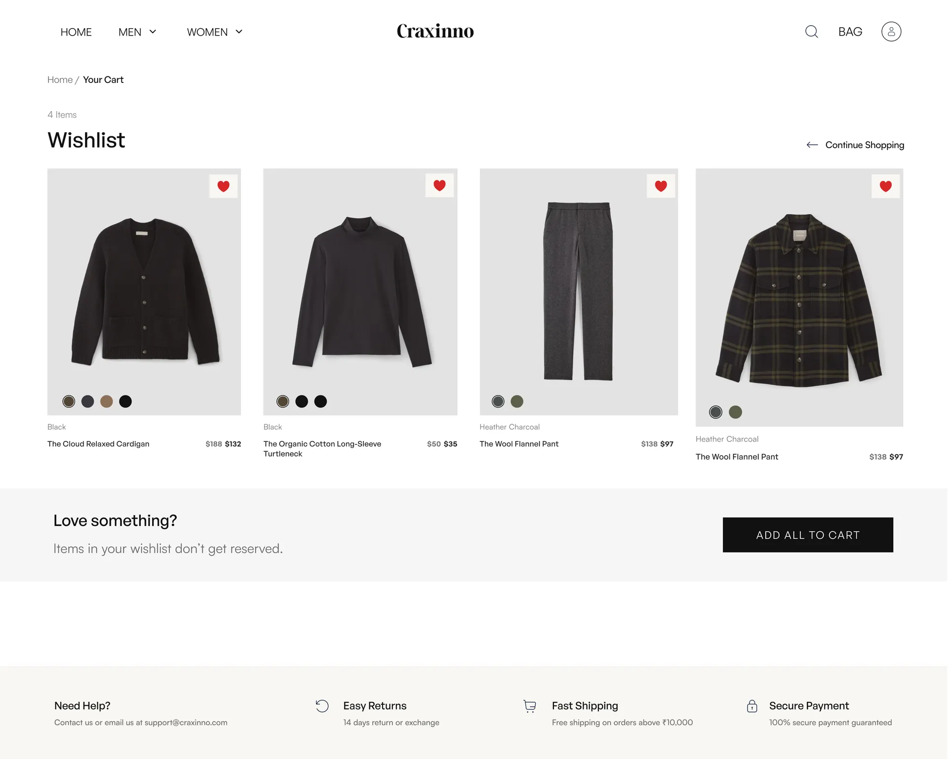
The store spans the full purchase journey. A Home page opens with a model hero, value props, category tiles, a trending carousel, brand storytelling, and a newsletter join. A category listing pairs faceted filters (category, color, size) with a clean product grid and pagination. A product detail page carries gallery thumbnails, size and color pickers, description, and similar products. A cart with order summary and promo, a wishlist with add-all, and a split-image login round out the flow.
The design sells through clarity. Faceted filters and 249-product depth make a large catalog feel browsable, not overwhelming. Strike-through discount pricing and "30% off" tags drive urgency without clutter. The product page keeps size, color, and add-to-cart above the fold, while wishlist and "you might also like" rails keep shoppers moving. A clean order summary with promo, shipping, and secure-payment badges builds trust right at checkout.
The result is a fashion store that feels like a campaign but checks out like modern commerce — editorial enough to covet, structured enough to scale. Calm grids, faceted filtering, and trust-building checkout keep desire and conversion working together. Built on a modern responsive stack with React, the design scales cleanly from lookbook hero to order summary. Want this kind of polish for your store or brand? Reach us at hello@craxinno.com or craxinno.com.