01·Conductor OS Logo Design — Orchestration System Brand Identity
02 / 05
02·Conductor OS Logo Design — Orchestration System Brand Identity
03 / 05
03·Conductor OS Logo Design — Orchestration System Brand Identity
04 / 05
04·Conductor OS Logo Design — Orchestration System Brand Identity
05 / 05
05·Conductor OS Logo Design — Orchestration System Brand Identity
About this shot
Overview The Conductor OS logo design builds a single orchestration mark from layered lines that resolve into the letter C, giving an AI-driven operating system a brand identity rooted in clarity and control. Conductor OS coordinates complex systems, so the mark had to read as structure, not decoration. We approached it as a construction study — showing how separate elements align, connect, then merge into one unified symbol. The result is an electric-blue identity that feels engineered, confident, and built for a product that manages moving parts. See more web design work on our design wall, or explore full design services.
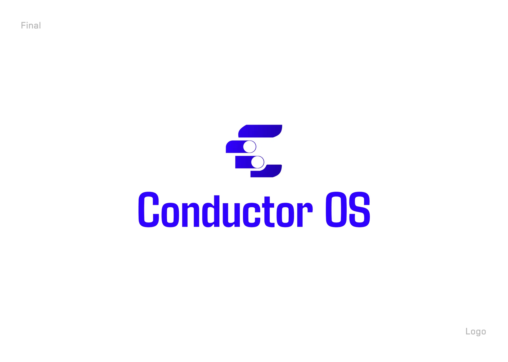
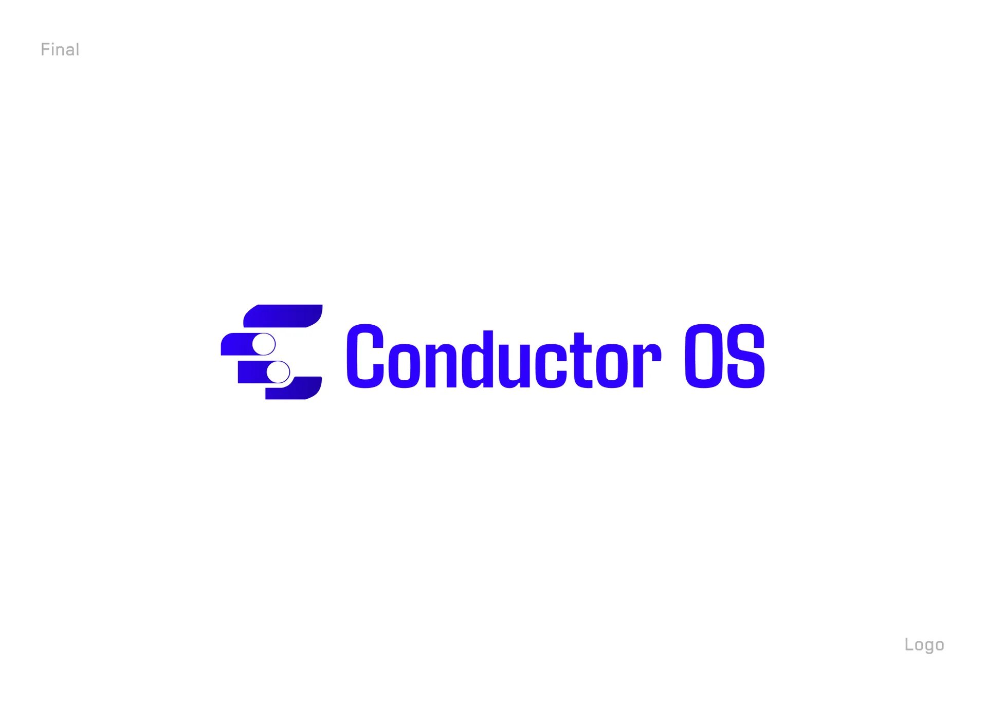
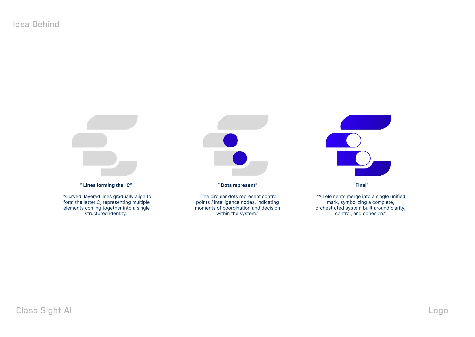
The Design Approach Every stage of the Conductor OS logo design was made visible, not hidden. Curved, layered lines gradually align to form the C — multiple elements coming together into a single structured identity. Circular dots then enter as control points and intelligence nodes, marking moments of coordination and decision inside the system. The final step merges all elements into one mark. The wordmark pairs a condensed, technical display face with the symbol, reinforcing an operating-system feel: precise, mechanical, and legible at any scale.
What We Delivered The engagement produced a complete primary identity: the C monogram, the horizontal lockup with the Conductor OS wordmark, and a documented construction rationale. We supplied the mark on a saturated electric-blue field and in white for dark and light contexts, plus the reasoning behind each build stage so the brand can be extended consistently. Deliverables covered the logo presentation, the "idea behind" breakdown, and the final lockup ready for product, web, and deck use.
Key Outcomes Surfaced The identity gives Conductor OS a mark that scales from favicon to hero without losing meaning. The monogram alone signals the brand, while the lockup carries the full name where space allows. The layered-C concept ties directly to the product story — orchestration, coordination, cohesion — so the visual and the value proposition reinforce each other. The condensed wordmark keeps the system feeling technical and premium across every touchpoint.
Built to Represent The Conductor OS logo design is built to represent an AI orchestration platform across product UI, marketing, and investor materials. The condensed geometry and node motif carry the "control and coordination" idea into any surface — dark app shells, light docs, social avatars. Designed in Figma with vector refinement, the mark stays crisp from app icon to billboard, giving the brand one confident, ownable symbol.