01·Blitz POS Logo Design — Lightning-Fast Payment Brand Identity
02 / 05
02·Blitz POS Logo Design — Lightning-Fast Payment Brand Identity
03 / 05
03·Blitz POS Logo Design — Lightning-Fast Payment Brand Identity
04 / 05
04·Blitz POS Logo Design — Lightning-Fast Payment Brand Identity
05 / 05
05·Blitz POS Logo Design — Lightning-Fast Payment Brand Identity
About this shot
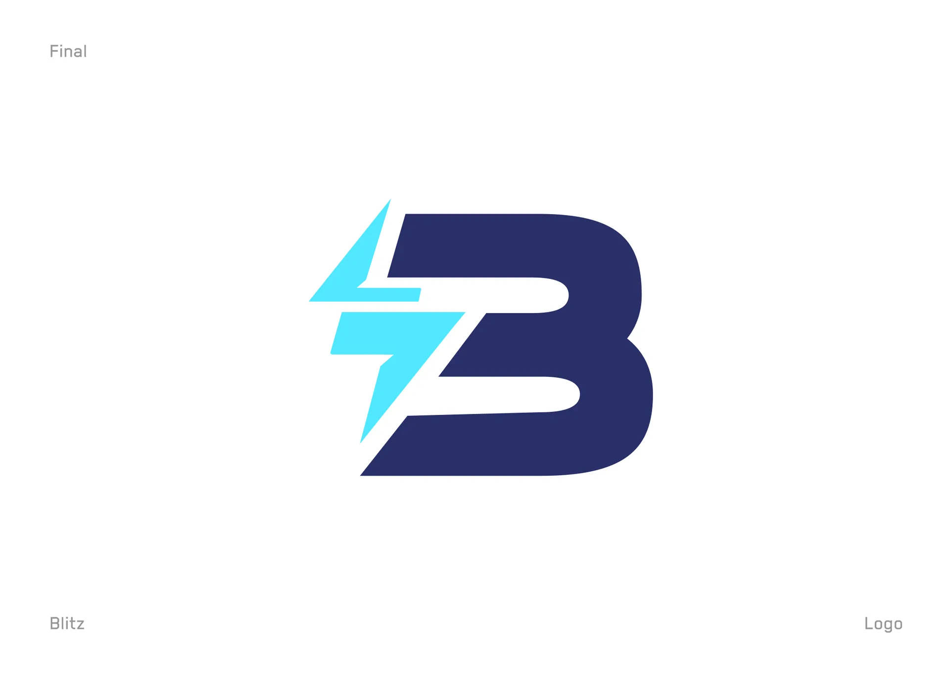
Overview The Blitz POS logo design fuses a lightning bolt with a credit card to give a point-of-sale platform a mark that signals speed and payment in one glance. Blitz POS processes transactions fast, so the identity had to feel instant — energetic, sharp, unmistakably fintech. We built the mark by combining two ideas, a thunderbolt and a swipe card, into a single geometric symbol that locks up with a bold italic wordmark. The result is a confident, high-velocity identity built for retail speed. See more web design work on our design wall, or explore full design services.
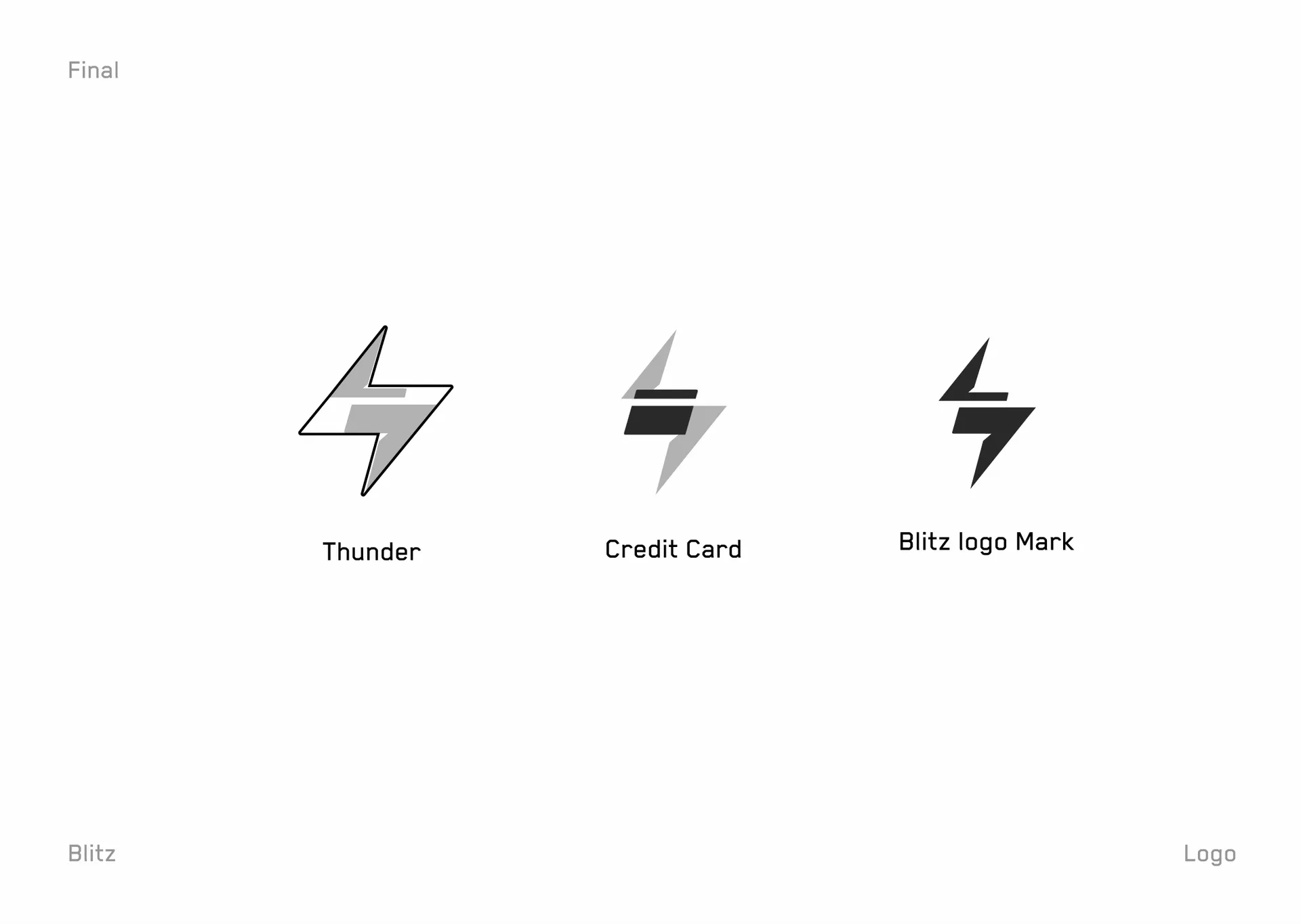
The Design Approach The Blitz POS logo design started from two source concepts held side by side. A thunderbolt carried the "blitz" — raw speed and power. A credit card carried the "POS" — the transaction itself. We overlapped them so the negative space of the bolt reads as a card swipe, merging meaning and form into one mark. The italic, condensed wordmark leans forward to reinforce momentum, while the cyan-on-navy palette keeps the brand feeling electric, modern, and trustworthy for payments.
What We Delivered The engagement produced a complete primary identity: the Blitz bolt-card monogram, the full horizontal lockup with the Blitz POS wordmark, and the exploration showing how thunder and credit-card forms fused into the final mark. We supplied the logo on a deep-navy field and in mono black for flexible use, plus the construction rationale so the brand extends cleanly across product, hardware, and marketing. Deliverables covered the logo presentation, the concept breakdown, and the final lockup.
Key Outcomes Surfaced The identity gives Blitz POS a mark that works from terminal screen to app icon to signage without losing energy. The bolt monogram alone carries the brand, while the lockup delivers the full name where space allows. The dual-meaning concept — speed plus payment — ties the visual straight to the product promise, so customers read "fast checkout" before they read a word. The italic wordmark keeps the whole system feeling quick and premium.
Built to Represent The Blitz POS logo design is built to represent a fast payment platform across POS hardware, mobile apps, and retail marketing. The bolt-and-card motif carries the "instant transaction" idea onto any surface — terminal boot screens, receipts, app stores, storefront decals. Designed in Figma with vector refinement, the mark stays sharp from a favicon to a full storefront sign, giving Blitz POS one bold, ownable symbol that reads at a glance.